Brief Data Post
Part I
This is the first in a series of occasional posts that will provide charts of some new and interesting data or data that has been replotted from elsewhere to facilitate understanding or improve the quality of visualization.
The European Diaspora in America
This map shows the American diaspora each European country has relative to their own populations.
The map is interesting, but it is worth noting that the numbers for England, Scotland, and Wales are certainly wrong and Northern Ireland is mislabeled. Many people with British ancestry in the United States identify as “American” alone, rather than as one or more of the British ethnicities. This map would probably make Benjamin Franklin proud. For more on the ancestry of Americans, I recommend this post.
Future iterations should look at Asia, Africa, and Latin America, although all of those should be fairly uninteresting. I’d be interested in seeing combined American, Canadian, Australia, and New Zealand European diaspora numbers.
A Permitting Decline Preceded the 2008 Housing Crisis
This graph is probably already popular
But for those who have already seen it, have you also bothered to look at it closely? It can be hard because some cities - Dallas and Houston - chose to clobber the rest of the country in permitting rates. I tried to fix their extremeness by using relative rates and it helps a bit, but not enough. So, to really show the decline in permitting that seemed to precede the 2008 housing crisis and, in most cases never recovered, I have split all the data up by MSA. Because all the variation by city is visible like this, I have changed the format back to per capita rather than per capita relative rates.
The typical MSA experienced a precipitous decline in new housing permitting in 2005, plus up to 1 (Houston, LA) or minus up to 3 years (D.C.) . It’s an open question why they would do that, and if people have answers, I would love to hear them. Future iterations of this work should expand to looking at single versus multi-family permitting, more MSAs, cities, counties, etc., and more countries.
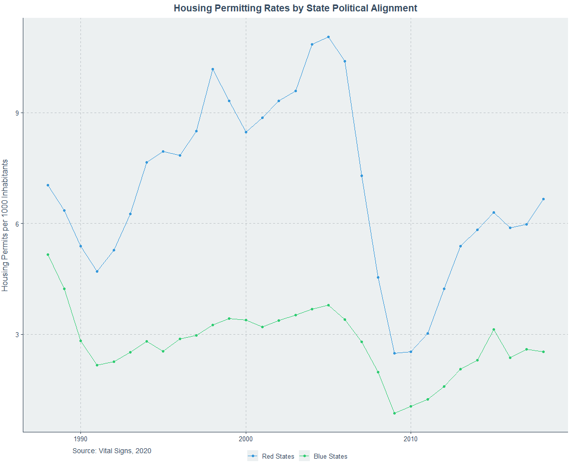
Because some people requested it, I added the per capita graphs for all of the areas and red and blue states, below.
Here’s a substantive note and a speculative one. The substantive note is that Miami has changed. DeSantis’ permitting reform has bill has led to a recovery, but it’s not visible in the data above because the reform happened in 2021 and that data ends in 2018. The Washington Post ran a story on Florida’s reform and it’s worth a read. The speculative note is that the permitting decline that preceded the crisis by a few years was part of its cause because it pushed up housing prices or otherwise allowed them to climb by fueling the bubble through building up the perception that housing was a good investment vehicle. But given that prices peaked around 2006, this seems like poor speculation. Maybe the permitting decline was a response to the rush to buy homes and it successfully staunched demand, leading to the peak.
This very relevant Twitter thread also brought me to some data from three different timepoints showing that - well, look at the titles
So as of 2019, there still were still practically zero cities with lots of construction and high housing prices. Cities were either
Purple: Places where lots of people want to live but few build, causing high prices.
Blue: Places with low demand and low levels of building, causing low prices.
Green: Places with ample building and modest to high demand, causing low prices.
Red: Places with such demand that their impressive building must grow further.
Given the recent housing boom and the Great Resignation, things may have changed and this pattern may no longer hold, but given its consistency over so long a period of time and the overwhelming economic logic that favors this observation’s continued existence, I doubt it.
A Short History of American Vaccination Perceptions
Everyone who’s been paying attention knows Republicans are rapidly moving towards an anti-vaccine orientation. This seems to be a problem that’s been around for a while and has been getting worse. I recently found some Gallup data on it, so here’s a plot.
With the first observation in 1954 for the polio vaccine, Republicans are less accepting than Democrats, but the gap is small, at only 2 percentage points. At this point, independents are actually marginally worse by 6 percentage points. By 1957, the acceptance of the Asian flu vaccine has started to build the gap: Republicans now lag democrats by 8 percentage points. In 2002, Republicans lagged Democrats by 11 percentage points for the smallpox vaccine. In 2009, they lagged by 15 percentage points for the Swine flu vaccine. 2020 was the worst year on record, with an incredible 34 percentage point gap.
How long until the gap is larger than the number of Republicans who accept vaccines? How will this affect their electoral success? We already know that Republican rejection of the vaccines has led to an unprecedented and extreme excess mortality gap with Democrats, so this ought to be a real concern for them.
The one reassuring note is that at least Trump is pro-vaccine, even if his supporters aren’t.
Future work needs to provide more granularity. Experimental manipulations to figure out why this trend is occurring at least sound plausible. For example, it might be interesting to see how vaccine attitudes change when parents are made aware of how similar the preschool vaccination schedule’s parts are in function to the COVID-19 vaccine. Or perhaps that’s not worth it because it could be an infohazard not unlike the numerous unintuitive statistics that continue to befuddle the statistically illiterate and growing section of the public that fears vaccines.
The Dodo Bird (Verdict) is Not Yet Extinct
Who said the Dodo couldn’t fly? Ever since the Dodo bird verdict arrived in psychotherapy in the mid-1970s, it has been controversial, but it has also stood strong. The verdict holds that all psychotherapies and, more broadly, mental illness treatment methods produce equivalent results. A new meta-analysis of cognitive behavioral therapy (CBT) versus control conditions and other therapeutic options has confirmed it yet again.
Fighting against controls, CBT might win. The evidence is a bit ambiguous. These are the trim-and-fill corrected results, but some of them are at risk of bias in study design and examination and that correction alongside publication bias correction renders these results non-significant except for the post-test result, which becomes marginal. What about versus other psychotherapies?
There is nothing to even think about here. What about versus other broad treatment categories including pharmacotherapies and combined psycho- and pharmacotherapy?
Correcting this for likely bias, nothing remains significant, but just using trim-and-fill, there might be some evidence for improved results with combined treatment versus CBT alone. But given the fact that publication bias is hard to truly correct for, these estimates are probably still too high.
Future work should involve large, preregistered replications. If these therapies are going to be used, we should get to know how well they work, and we cannot trust meta-analyses full of garbage to give us results that aren’t at least tainted.
Hauser’s Law was Borne of the Second World War
The observation that federal tax revenues have varied between roughly 14% and 20% for about 80 years has come to be known as “Hauser’s Law”. But how did this come to be? The answer lies in World War II. Take a look:
Federal outlays greatly increased alongside federal tax revenues. But more stunningly,
the proportion of people paying the income tax exploded. I elected not to plot this with two y-axes to avoid any complaints, but replotting it is easy to do if you want to because all the data is publicly available. The deficits, outlays, and receipts come from FRED and the income tax payer numbers come from David Splinter.
Looking at this data, a reasonable question is how can these be true when government spending has grown? And the answer lies at the state and local level.
Notice that looking further back, federal outlays also grew with World War I. It seems that when there’s an excuse to spend a lot, the course is only partly reversed. It’s worth noting that some people have argued that the importance of state and local spending for the purposes of growing the government is a good reason to cap or eliminate SALT.
Nonlinearities in the Relationship between IQ and Income?
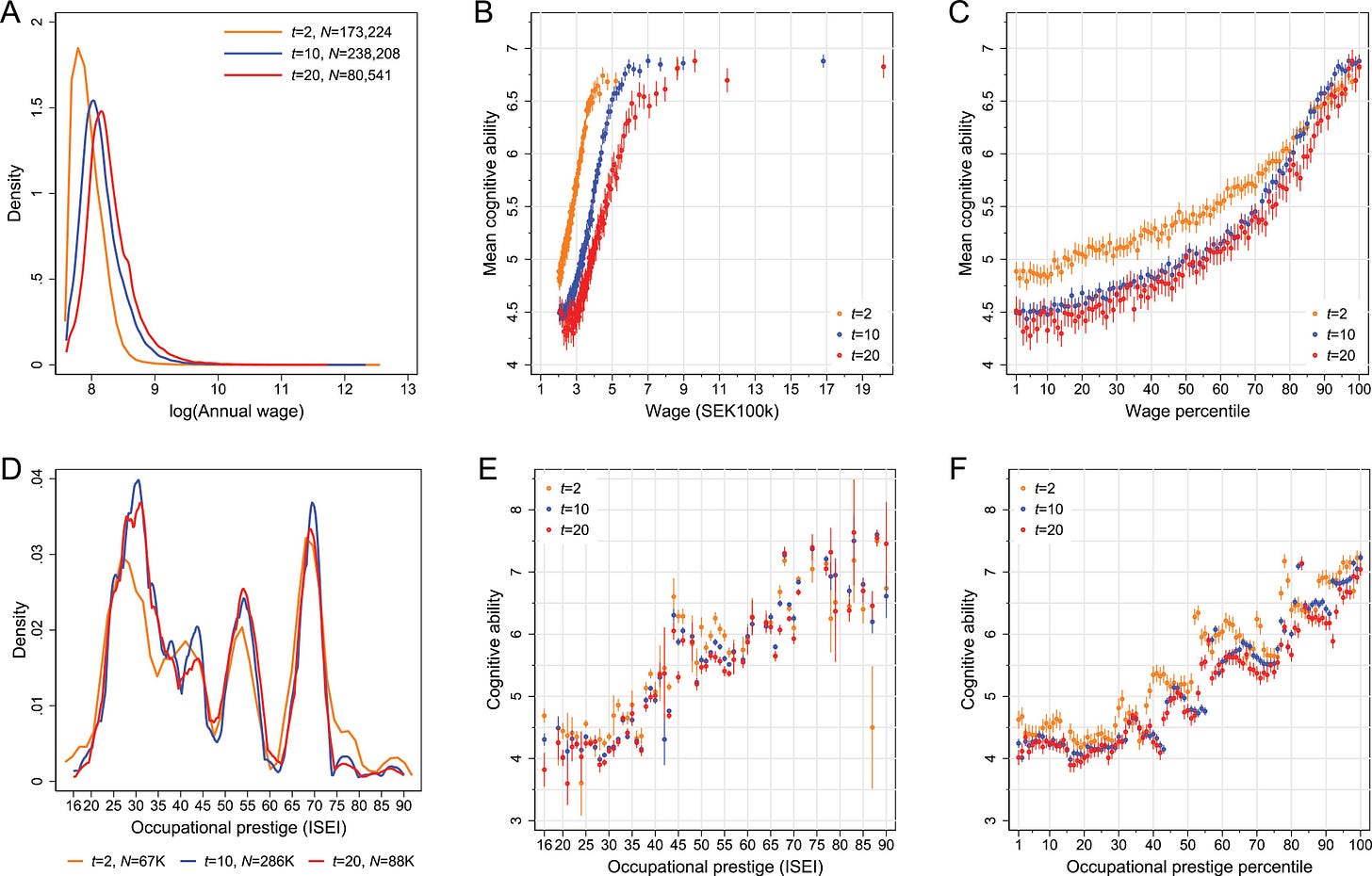
A new paper alleges that the relationship between cognitive ability and income in Sweden plateaus after going up about one standard deviation in IQ.
First thing: the interpretation that the effect of IQ plateaus at a cognitive ability score of about 7.25 (0.91 SDs, per their summary statistics) is not supported. The reason is the damnable effects of binning, but to see it, we need to look at the plateau on the lower end as well. On that end, we get a plateau at about 4.25 (-0.61 SDs). How do you take a continuous, mostly normally distributed variable and a continuous, positively-skewed variable like wages or income, and get a population-level correlation between the two of ρ = 0.40, with no relationship below -0.61 SDs or above 0.91 SDs? Obviously you would need a strong correlation in between, but how strong? It can be hard to know, but, luckily, we can simulate.
To do this, I’m going to first simulate data where there is no relationship between “Wage Percentile” (X) and “Cognitive Ability” (Y) below the 40th percentile of X and above the 90th percentile of Y. It looks like this. For this initial simulation, I will use typical stanine binning even though the Swedish study featured atypical binning that likely disturbed their results somewhat. I will return to that.
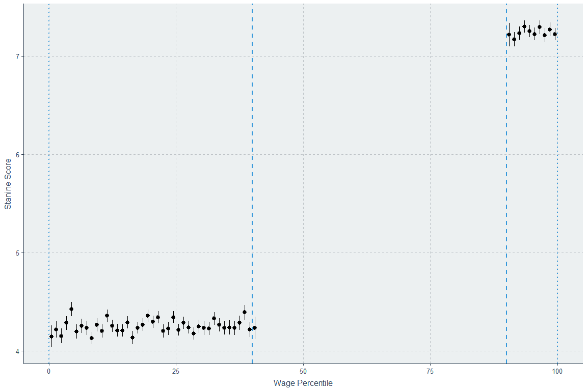
Now we can iterate through simulated data that yields an unbinned whole sample (i.e., individual participant correlation) Spearman correlation of ρ = 0.40 with stanine scores, 59,387 rows, and no significant gap between the points at the 40th and 41st percentiles or the 89th and 90th percentiles. If we allow a gap, we can easily simulate data that fits this condition and doesn’t look like the Swedish data.
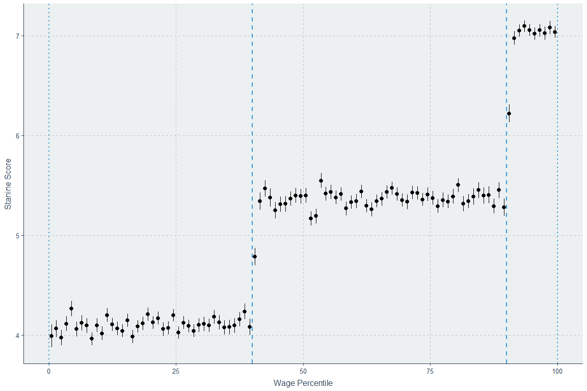
Before showing the results of the simulation exercise, here’s something interesting: Spearman’s ρ in that chart is already 0.363 - very close to the desired 0.40 - even with this enormous discontinuity. The reason is that if you just draw a regression between subgroups with differing means for X and Y, even if there is no relationship within either group between X and Y, you will observe a substantial correlation, regression beta, etc. because the means covary due to the existence of the different groups. This issue, featured in Figure 2F here, should motivate people to plot their data before presenting correlations. Anyway, if the middle section has no correlation, we get this, which is clearly wrong:
The whole sample correlation there is 0.403 - acceptable. If the correlation in the interval is exactly equal to what we want, 0.4, it still fails, although it increases to 0.458.
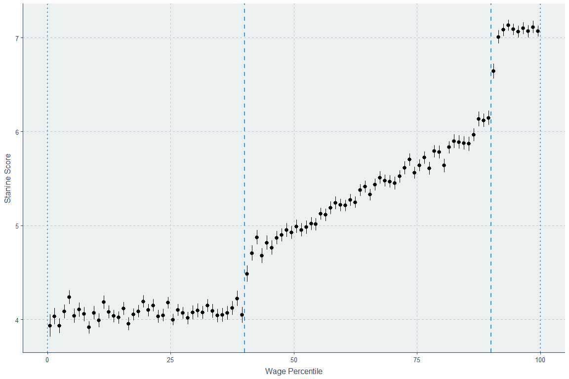
We have to have a much more extreme correlation to match the form of the Swedish data, but if we do, like this:
we also end up with an unacceptable total sample correlation of 0.533, which is 133.25% of the correlation we want, and is thus clearly too large. If we add a dip in the middle of the 0 to 40th percentile interval while maintaining no correlation within it like the Swedish data, and if we cause a downtrend such that the 96th percentile is above the 99th percentile, we manage to eek out a correlation of 0.554, and we raise the 1st percentile wage’s estimated cognitive ability up to the 5 we want to match the Swedes. But that whole sample correlation is way too large, and we’ve lost the desired cognitive ability mean of 5.45 with an SD of 1.98.
It is unlikely that the Swedish data came from a data-generating process that created a discontinuity below the 40th percentile and above the 90th one. However, it is utterly trivial to generate data that is more consistent with in the form of two random variables that are linearly correlated like we want and that we can then bin into screwy stanines we can use to get basically exactly what was observed in the Swedish data.
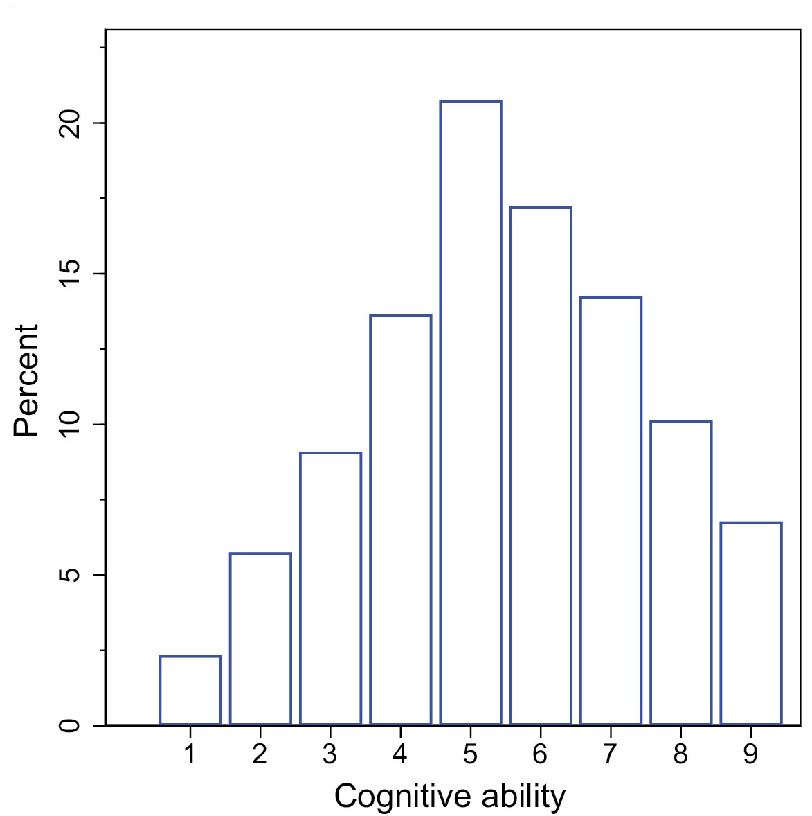
The screwy stanine note is important, because it augments the likelihood that regression to the mean makes the extreme right tail’s cognitive ability estimate unreliable whilst also making it easy to create an extended plateau on the lower end of the distribution. Here’s how the stanines used in the Swedish study looked:
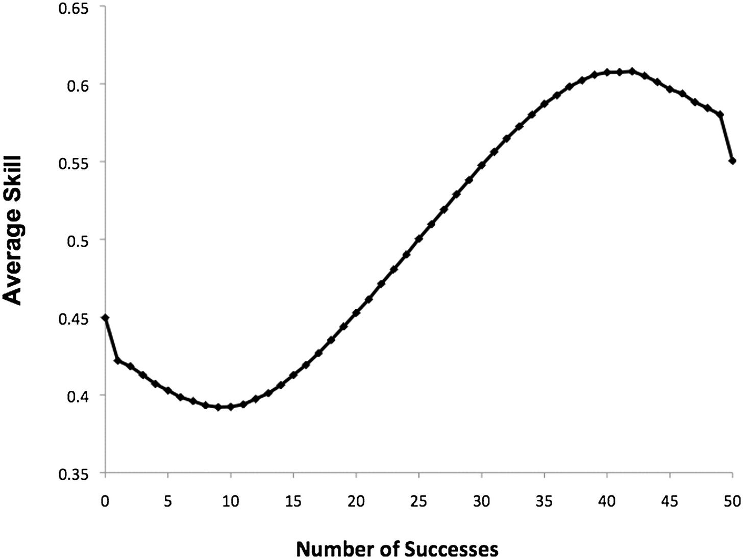
A correct stanine distribution has 4% in first band (1), 7% in the second band (2), 12% in the third band, 17% in the fourth band, 20% in the fifth band, 17% in the sixth band, 12% in the seventh band, 7% in the eighth band, and 4% in the 9th band. This one had 2.27% in the first band, 5.71% in the second band, 9.02% in the third band, 13.59% in the fourth band, 20.72% in the fifth band, 17.21% in the sixth band, 14.23% in the 7th band, 10.04% in the eighth band, and 6.71% in the ninth band with a bit of rounding error. The resulting range restriction cannot be ignored, but the authors believed that showing the percentage in each wage bin who reached a score of 9 hadn’t peaked would address it. The issue is that such data is binned, and unreliability means the extreme bins will showcase more severe regression to the mean effects, and the more extremely binned they are, the worse this is. A study mentioned by the study’s authors explained this phenomenon very well and also provided a handy illustration to boot! The title is a great explanation of the implications of regression to the mean: Top performers are not the most impressive when extreme performance indicates unreliability.
Any drop-off in the wage percentiles scoring the maximum that we observe could be driven by anything, from substance to error, but because we know the data is skewed more severely than it should be, we should lean towards error since we know it has to play a role. This test has been noted to have a reliability of about 0.93 between the pen and paper and computerized formats, but with the Flynn effect and the resulting ceiling on scores, this has certainly dropped.
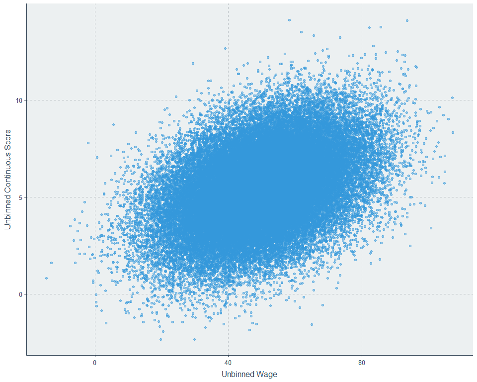
These screwy stanines are skewed in a way that makes the result observed in the Swedish sample a likely statistical artefact, and they make it easy to show. Here’s our unbinned data:
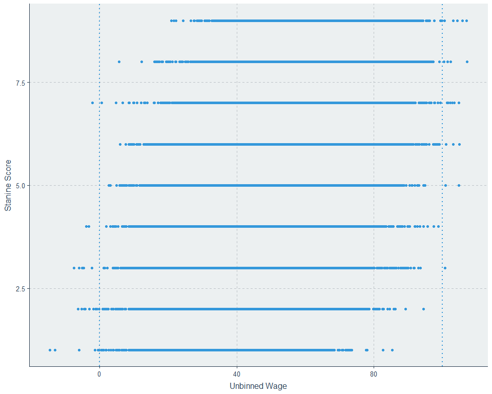
Now lets throw it into stanines, the things that can help explain the binned result, but also make the graph ugly and kill our ability to determine if there’s linearity in the general population:
And now, we’ll turn this somewhat noisy data generated from a decidedly linear data-generation process into percentiles and
we get something remarkably like the Swedish data and the 0.40 correlation is preserved. So, do we know that their study showed nonlinearity? Not at all. It’s consistent with error, a screwy stanine distribution, and linearity among individuals.1
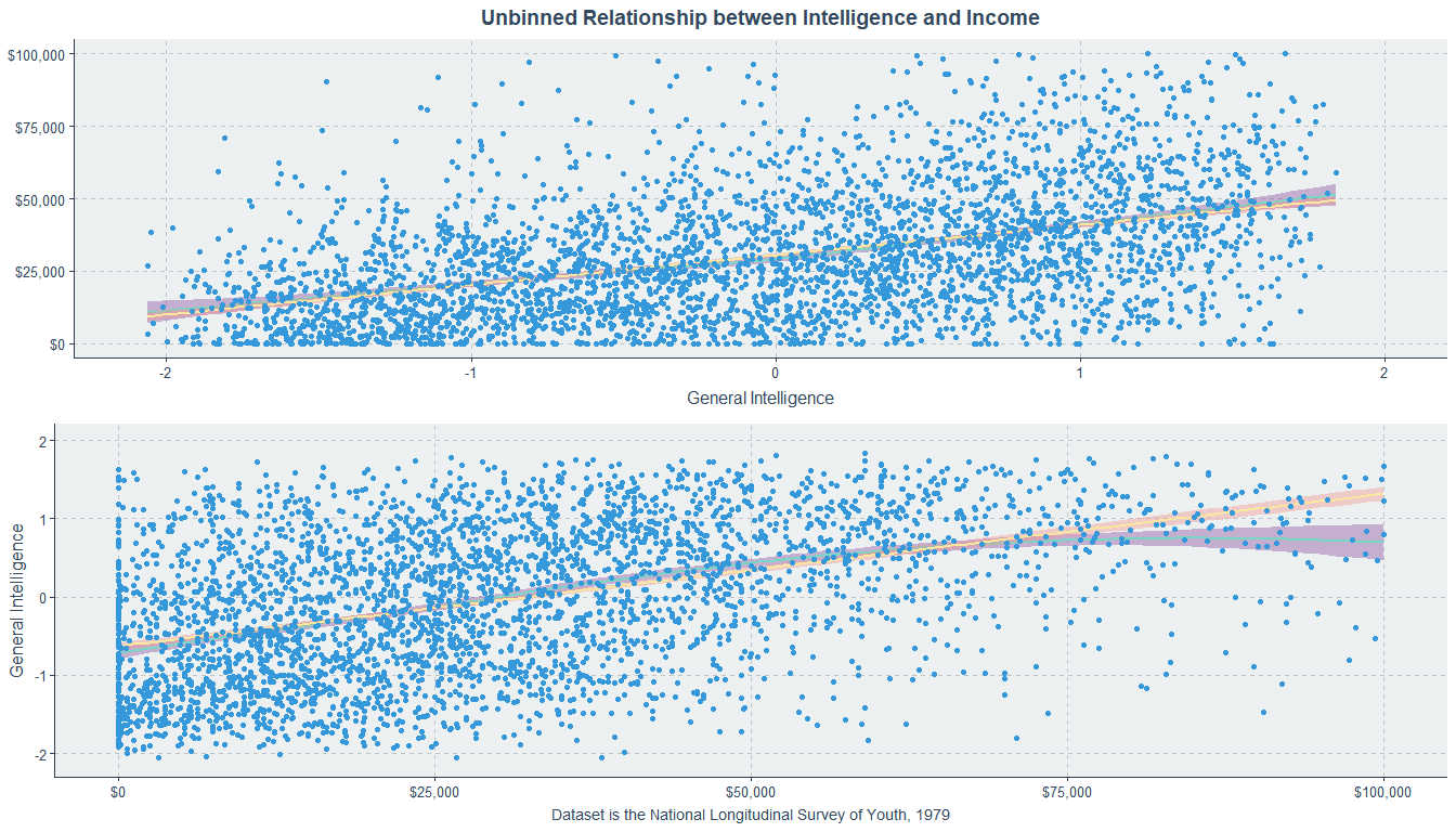
So, lets look at two more pieces of data. There’s one that’s available and there’s one that’s from another paper using registry data. Let’s use the National Longitudinal Survey of Youth 1979 (NLSY79). Here’s how its IQ variable looks if we compute a factor score, equally bin it into nine bins, put it into stanines, or put it into stanines like the Swedish study had.
The income variable is the average of income for males in the years 1998 through 2004, around the age when their incomes become stable. The range for income in this data is comparable to the range in the United States in general, but its maximum is not as impressive as the maximum wage in the Swedish data which was 8,440,000 SEK, or roughly $1.2 million dollars in the year 2003 and $799,067 now. Here’s how the NLSY79 holds up compared to household income data from DQYDJ.
So this data is probably fine for inferences about income. With this data, there’s one trivial way to induce nonlinearity, and it’s by swapping the axes. See?
You can get a similar appearance of nonlinearity - at least at the low end - if you bin American data. You don’t get some of the reported results, but they’re probably due to low power anyway.
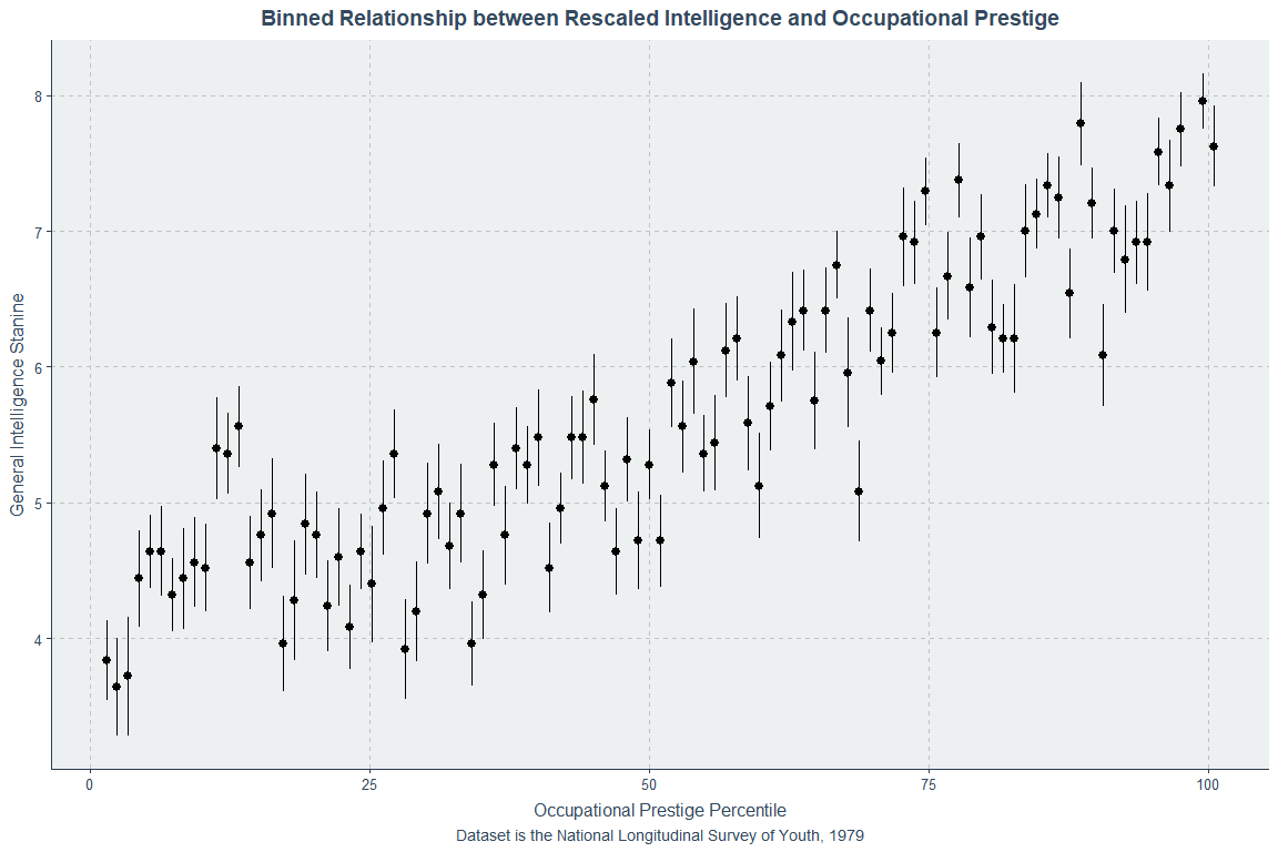
And, like the original study, the individual-level rank correlation is about 0.4 (ρ = 0.456). With normal stanines, the correlation is 0.464. Lets also look at the relationship with occupational prestige (average between 1998 and 2002, because 2004 changed the coding) where the correlation in the whole sample was 0.508:
If the Swedish study is correct, it is probably only correct for Sweden and countries with similar labor market incentives, and not for the vast majority of people. Sweden’s high marginal tax rates may push people into earning status outside of earning higher incomes. Since linearity is observed with respect to both income and occupational prestige in the U.S., that doesn’t seem to be it, at least at a first glance, but the U.S. data also needs to go out much further to get the coverage the Swedish data had. At some level, it seems like the Swedish study should be right, because if it weren’t true in the limit, extremely high incomes should come with implausibly high IQs. A simple intuition check is to just look at the percentage of people with extremely high incomes versus extremely high IQs. The distributions are different in a way that matters: there’s normality for IQ but positive skew for incomes, so at some level, the Swedish result must be right with respect to a plateau, but not necessarily with respect to a decline going from, say, the 95th to the 99th percentiles.
So how do we know what’s right? I’ll continue to talk about this in terms of the problem for people in general rather than a tail coverage issue. The problem with this study was that they didn’t even try to know what was right (one of the authors has commented on Twitter to the effect that he believes flipping the axes genuinely changes the estimand) and, because the data is given in stanines, they couldn’t know unless they could get the pre-transformation data.
They plotted IQ against wages rather than wages against IQ, which, to be understood in common, requires reflecting the result across a 45° line and putting the variables on the same scales. If people stopped comparing rank to non-rank data, that would be a good outcome of this, but their data wasn’t available, so we can’t fix that mistake. Just doing the first thing,
The result changed to monotonic increase! But the authors already concluded that, it seems.
The monotonicity of the relationship in Figure 3A is consistent with previous studies (Lubinski, 2016; Gensowski, 2018) rejecting the claim that past a certain threshold having even higher cognitive ability does not matter (Gladwell, 2008).
A benefit of this flipping of the axes is that it makes unreliability explaining the right tail results is a bit clearer. Since we don’t have the data, we can’t assess the effect of things like employment status/nonwork or do anything really interesting with this data either. Oh well! Looking at the tenure length grouped analyses, the plateau effect where the smartest weren’t the richest didn’t replicate.
The authors made another interesting claim about their data that I’ve seen too many taking seriously:
This plateauing of the wage–ability relation occurs at approximately SEK600,000 annual wage (about €60,000). In the three top wage percentiles, that earn between SEK800,000 and SEK8,400,000 annually, the relationship even slightly reverses.
And they also described this as
The top 1 per cent even score slightly worse on cognitive ability than those in the income strata right below them.
But it means their monotonicity conclusion is wrong at some level and there’s not even a good reason to think it. The 99th percentile and the highest other scoring percentile, the 96th, scored 7.15 (95% CI: 7.04 - 7.25) and 7.32 (7.21 - 7.32). These are significantly different, but the p-value is just 0.03, or marginal at best. Since we know error was involved, we need to correct accordingly. Assuming a reliability of 0.93, the scores and their CIs can be adjusted using Kelley’s formula to get 7.04 (6.93 - 7.14) and 7.20 (7.09 - 7.31). That means a p-value for the difference of 0.04 - the most marginal of p-values. If we interpret this like it’s something we should see in the whole sample, with an n of 59,387, that p-value is actually more consistent with the null than with the alternative hypothesis. Given that every other top-end difference with the 99th percentile is even less significant and thus not significant, the authors’ claim is overstated and their claim that a similar pattern (of what, finding noise to speculate about?) was observed for occupational prestige is even worse, since in that data, the evidence for a plateau at the top end is basically nonexistent, it’s shifted 20 percentiles to the left for the lower plateau, and the 99th percentile of occupational prestige are the smartest in the sample (but not significantly, because the 78th percentile is for some reason not significantly different despite everything else being even lower).
Another registry study - this time from Denmark - looked at individual level prediction, avoiding some of these transformation issues. This study had an 18.5 times larger sample than the Swedish one and it did not have a range-restricted IQ test that was turned unusable for individual-level inference by being transformed into stanines like the Swedish study did. Here’s what its result looks like:
But that wasn’t all they looked at:
Before moving on, why don’t we have more datasets with multiple testing instances so we can eliminate this problem? Theoretically, we might be able to make relationships like the Swedish study observed more linear, because extremely high performers will regress due to error-contaminated scores, and extremely low performers will egress for the same reason. The substantive interpretation of their data, that the exceptionally rich are less likely to be intelligent is basically impossible to support when this issue haunts their data and they don’t have any way to address it. Perhaps future work could use datasets with multiple testing instances like the CNLSY to tease out unreliability effects from substantial ones that, currently, need better documentation.
I’m putting the Swedish study in the mental bin where Swedish studies that need open data to be credible go. It’s interesting, provocative, and will probably get a lot of citations, but it’s not especially informative, and there’s good reason to think it’s wrong.2
Abundance, Political Goals, and a Black-White Gap
I tend not to like the Roosevelt Institute, but I can appreciate when they make a great point. They have provided a point in favor of an abundance progressive agenda. Turn to Figure 5B:
If your economy is hot, some of your social goals will be solved all on their own. Given that the human capital contribution to the Black-White earnings gap is increasingly about non-work rather than returns to skill, this is a significant fact. Given the extremely low poverty rates among the employed, it is an even more significant fact. Basically every labor crunch also supports this finding. Another example of how abundance generates progress comes from the Housing and Urban Development authority, who found that more relaxed housing markets have more successful housing voucher programs.
Who Drives the Male-Female Wage Gap?
One group of people seems to drive the male-female wage gap: married men.
Notably, marriage doesn’t seem to stunt women compared to their single peers. Admittedly, this might make a case for married women having stunted labor market prospects if the selection into marriage observed among men also acts in women and assortative mating for abilities holds.
Engel’s Law and Japan
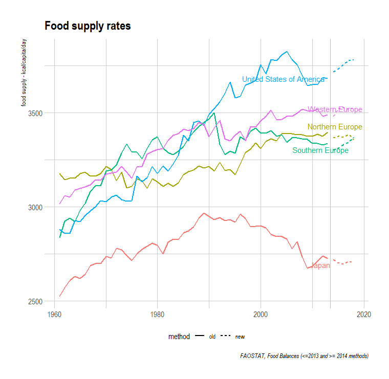
Engel’s Law holds that as countries grow wealthier, they spend smaller portions of their incomes on food, but they spend more on food in total. Japan has realized real GDP per capita gains but, unlike the West, Africa, and Latin America, it has managed to curb its total food consumption. This might have to do with age, but regardless of what causes it, they’ve managed to hold off the few hundred calories a day that caused America’s obesity epidemic.
In other data, the pattern of weight gain with wealth seems to be modest in Europe and America, sharp in Africa and Latin America, and flat in East Asia. Assembling more and better data to better understand this could yield very interesting findings.
Where’s all the Wind?
Per the Department of Energy’s 2022 Offshore Wind Market Report, the U.S. currently has 42MW of installed offshore wind generation in operation. However, that’s nothing compared to what’s sitting behind permitting barriers.
In order, these pipeline categories denote
Operating: Projects in operation and connected to the grid (42 MW).
Under Construction: Projects with all permitting completed and turbines, substructures, and cables in the process of being installed or onshore upgrades underway (932 MW).
Financial Close: Projects with all permitting completed that are ready to move to construction when sponsors announce their final investment decisions and finalize contracts (0 MW).
Approved: Projects the Bureau of Ocean Energy Management (BOEM) and federal, state, and local other agencies have reviewed, approved, and permitted in addition to having acquired interconnection agreements (0 MW).
Permitting: Projects where developers have site control of a lease area, have submitted a Construction and Operation Plan (COP) to BOEM, and BOEM has published their Notice of Intent to prepare the Environmental Impact Statement on the project’s COP. This category also includes projects stuck behind state-level permitting (18,581 MW).
Site Control: Projects where the developer has acquired the right to develop a lease and has begun surveying it (15,996 MW).
Unleased Wind Energy Area: Projects where the rights to a lease area have not yet been auctioned to offshore wind project developers, where the capacity is estimated to be 3 MW per square kilometer (4,532 MW).
Existing offshore wind capacity is 0.1% of the capacity we could have, but the offshore wind capacity stuck behind permitting (at least 18,581 MW) is >1.5% of total U.S. generation (~1.2m MW/1.2 TW). If we could fix the permitting process, this wouldn’t fix everything, but it would displace a lot of coal thanks to the merit order effect. It also wouldn’t cause as many intermittency problems as solar since wind does have a higher capacity factor than solar in general and offshore wind does especially. It’s also more resilient to seasonality. Take a look at the UK.
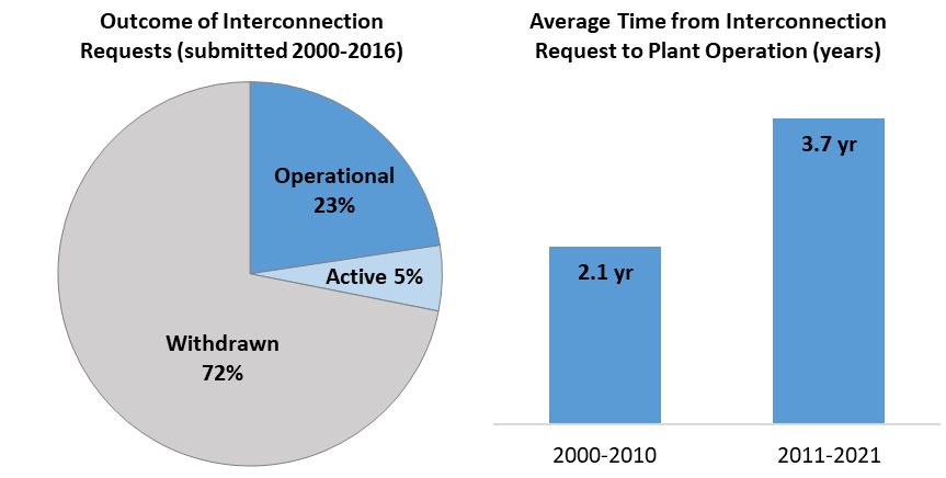
There’s a lot of hydro generation and pumped storage stuck behind permitting too. Someone should try to comprehensively assess how much capacity is locked behind permitting. A related topic that the Biden administration has recently begun to look at is the state of the interconnection queue. For reference, the U.S.’s roughly 1.2 TW of generation capacity as of 2021 was matched by just over 1 TW of generation and 0.4 TW of storage applications to connect to the grid. The graphs tell a clear story:
And we do have some relevant permitting data. It appears that it has gotten harder to connect to the grid as the number of projects has increased. This is a serious impediment to the future of America’s energy generation and it really is a shame that it seems permitting reform to fix it (and so much else) is dead in the water.
Here’s something else: data from the Energy Information Administration (EIA) indicated that America’s utility-scale battery capacity quadrupled between 2020 and 2022.
This might seem impressive, and to some extent, it is. If the rest of the capacity in the interconnection queue were added, it would also cause this number to skyrocket. But for context, this is equivalent to a single pumped hydro facility from the 1970s. This isn’t too shocking: pumped hydro is great and it’s simple enough that we’ve been using it for a long time. It’s unsurprising that 96% of global storage power capacity as of 2019 was pumped hydro (99% of global storage energy volume). Pumped hydro comes with other notable advantages, too, like not requiring absurd quantities of critical materials and tons of land, and it comes at a fraction of the cost. Take the Ludington Pumped Storage Power Plant, started in 1968, finished in 1973, at a cost of $327 million ($2.155 billion after inflation), with a storage capacity of 19,548 MW.
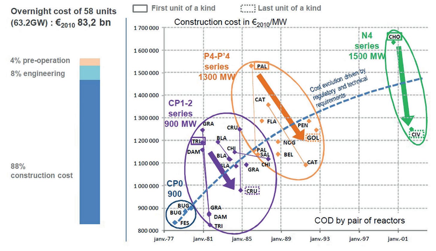
Simpson’s Paradox in the French Nuclear Cost Frontier
Many have noted that even the French cannot contain nuclear construction costs. The reality, however, is that French nuclear construction costs have risen due to increasing safety and generation capacity. If you plot French reactor series’ costs, learning curves in construction are very visible, and typically substantial! For the CP1-2 series, the French managed to drop construction costs by 17% from the first to the last construction, and by nearly a third for the least expensive reactor in the series. For the P4-P’4 series, the same cost decrements were 21% and 28%, and for the N4, roughly 25%, but there’s only been one additional build. France has pretty much been able to lower the costs of construction in new generations, which are initially high, into the middle of the pack for the previous generation. Here’s a plot:
And that’s it for Brief Data Post I.
Binning is often unintentionally problematic, but you can bin your data to get basically whatever results out of it if you want to be intentionally problematic. See Lubinski & Humphreys (1996).
In its substantial conclusions. As in all things, the ends will still often come apart.














Could you dig up the two archive links for "married men" again? Unfortunately archive.ph has been unusable most of the time in recent months. Would appreciate this a lot!
You could get more links to your posts if you broke them up. For example, there's a slice of Twitter that is strongly interested in energy policy. But this data post effectively hides that stuff way at the end.