
Intermarriage in America Post-Loving v. Virginia
From three years post-Loving v. Virginia through the COVID pandemic, how much and with whom are Americans mixing?

On June 12ᵗʰ, 1967, the U.S. Supreme Court decided the case of Loving v. Virginia, declaring that state laws banning interracial marriage violated the 14ᵗʰ Amendment’s Equal Protection and Due Process Clauses.
The status of laws banning interracial marriage stretched back to the American time immemorial, with their first implementation taking place in the Virginia colony in 1662. Two years later, Maryland implemented their own interracial marriage laws which would be applied in the 1681 case of Irish-born Eleanor Butler’s marriage to an African slave.1 By 1947, these laws were commonplace throughout the U.S.:

By the time 1966 had rolled around, they only remained in place in the American South, where there were the greatest numbers of African Americans.

Immediately after the case, they were in place nowhere, and that is the situation today.

Thanks to the U.S. Census and American Community Surveys, we have data to attest to how interracial marriage rates have developed since just three years after Loving v. Virginia. So let’s see how they’ve evolved.
Data Details and Formatting
For those interested less in how I handled this data and more in the results, scroll down to the section entitled “Interracial Marriage Rates” (or Click Here) and read from there.
All of my data for this analysis is taken from IPUMS. The samples include:
1970 1% State FM1
1980 5% State
1990 5% State
2000-2022 American Community Survey (ACS)
There are things worth noting about these:
The 2000-2005 ACS do not include persons in group quarters.
All samples are either 1%, 5%, or
0.13% for ACS 2000
0.43% for 2001
0.38% for 2002
0.42% for 2003
0.42% for 2004
The 2020 ACS uses experimental weights to correct for the effects of the COVID-19 pandemic on ACS data collection efforts.
In 2020, the coding of race responses changed, resulting in large, artefactual jumps in apparent interracial marriage rates
To identify spouses, I use the variable SPLOC. SPLOC indicates if a spouse lives in the same household and, if so, will provide their PERNUM identifier for their number within the household, which is numbered by SERIAL, allowing us to match spouses within homes.
To identify newlywed spouses, I use the variable MARRINYR. This is only available since 2008, and it tells whether a given marriage occurred within the previous year.
To identify the races of individuals, I use the variable RACE. RACE is a factor that takes nine values:
White
Black/African American
American Indian or Alaska Native
Chinese
Japanese
Other Asian or Pacific Islander
Other race, nec
Two major races
Three or more major races
To make this fit into the more typical White/Black/Asian/Hispanic/Multiracial schema, I have recoded this variable like so:
df <- df %>%
  mutate(RACE_CONSISTENT = case_when(
    HISPAN > 0 ~ "Hispanic",
    RACE == 1 ~ "White",
    RACE == 2 ~ "Black",
    RACE == 3 ~ "Amerindian",
    RACE %in% c(4, 5, 6) ~ "Asian",         # Chinese, Japanese, Other Asian or Pacific Islander
    RACE == 7 ~ "Other",                    # Other race, nec
    RACE %in% c(8, 9) ~ "Mixed-Race"        # Two major races, Three or more races
  ))
This results in a racial classification variable with the categories White, Black, Asian, Amerindian, Other, Mixed-Race, and Hispanic. I will only present results for the subset ACS containing Whites, Blacks, Asians, and Hispanics, as they are the current standard and, for most normal people, not confusing categories.2 The changes to how “Hispanic” worked and the survey was administered in 2020 due to the COVID-19 pandemic make a considerable difference to some people’s reports, so this is a sensible analytic choice. For example, as David Shor recorded, Brazilians in the U.S. went from classifying themselves as around 90% White to classifying themselves as 12.3% White in 2020 and 85.6% Hispanic. The following year, they changed back to 80% White.
Finally, my results are weighted at the household level using the weight HHWT and my analyses concern heterosexuals alone, but I am more than willing to expand this to include homosexuals or alternative weighting schemes as well if there’s demand for it. The reason for isolating to heterosexual households is pragmatic and out of theoretical interest. Pragmatically, identification is easier and we have more data available for heterosexuals since coverage of homosexual marriages only occurs after the Obergefell v. Hodges decision in 2015. Theoretically, homosexual marriages have very low fertility, so heterosexual interracial marriages are vastly more relevant to the future of race relations in the U.S.
Couple Identification
To start identifying couples, I subset to the part of the data within which people had spouses whom they lived with and I did some unnecessary, but perfunctory transformations of the variables just to make sure everything would work out without any fuss later:
data_with_spouse <- df %>%
  filter(SPLOC != 0) %>%
  mutate(PERNUM = as.integer(PERNUM),
         SPLOC = as.integer(SPLOC),
         SERIAL = as.integer(SERIAL),
         SEX = as.factor(SEX)
  )
I then generated keys to identify male and female members of couples:
data_with_spouse <- data_with_spouse %>%
  mutate(
    key_male = ifelse(SEX == '1', paste(YEAR, SERIAL, PERNUM, SPLOC, sep = "_"), NA),
    key_female = ifelse(SEX == '2', paste(YEAR, SERIAL, SPLOC, PERNUM, sep = "_"), NA)
  )
I then separated the dataset by sex:
data_males <- data_with_spouse %>% filter(!is.na(key_male)) %>% select(-key_female)
data_females <- data_with_spouse %>% filter(!is.na(key_female)) %>% select(-key_male)
I wanted to use a wide dataframe for the sake of simplicity, so I adjusted the column names to append _M for man and _W for woman:
colnames(data_males) <- ifelse(colnames(data_males) == "key_male", "key", paste0(colnames(data_males), "_M"))
colnames(data_females) <- ifelse(colnames(data_females) == "key_female", "key", paste0(colnames(data_females), "_W"))
After appending the identifying suffixes, I merged the data and purged the key column since it was no longer needed:
couple_data <- merge(data_males, data_females, by = "key")
couple_data$key <- NULL
From a dataframe initially containing 84,266,052 rows of people, this resulted in a dataframe containing 18,970,329 rows of couples, for a total of 37,940,658 people.
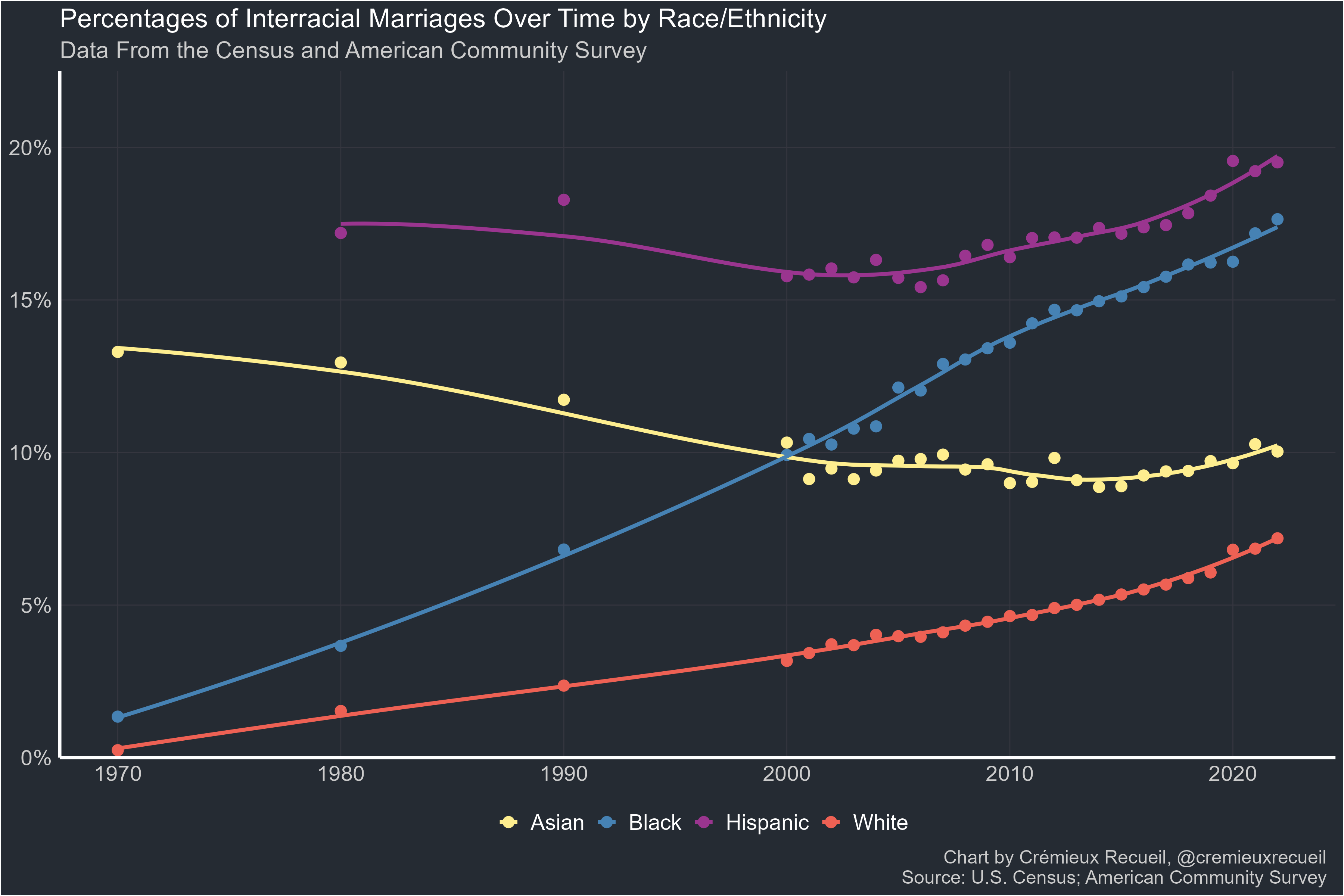
Interracial Marriage Rates
In this section, I will present the percentages of marriages that are interracial, defined as when spouses have a different value of the variable RACE_CONSISTENT, as defined above and after subsetting to only those individuals classified as Asian, White, Black, and Hispanic.

Refitting this result with method = “loess” results in a somewhat different plot:
For these next plots, I subset to the part of the dataframe where the variable MARRINYR was equal to 2, denoting that a couple had married in the previous year. When the method is a linear model, we get this result:

When the method is LOESS, we get this:

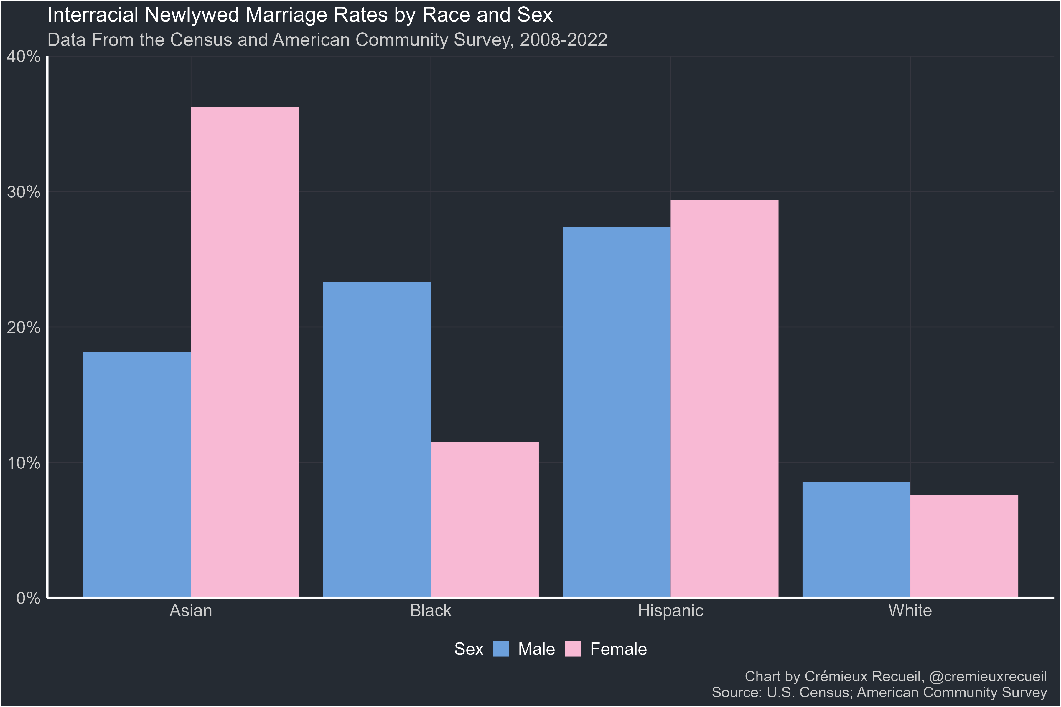
Sex Interactions
Interracial marriage rates vary by race, but they also vary by sex within race. Using all the available data, we get this pattern by sex:

When we subset to just newlyweds, the result changes becomes more extreme, but the same pattern persists.3
From here on out, I will be exclusively using LOESS. For those who desire linear model estimates, tell me and I can output them if there’s sufficient demand.
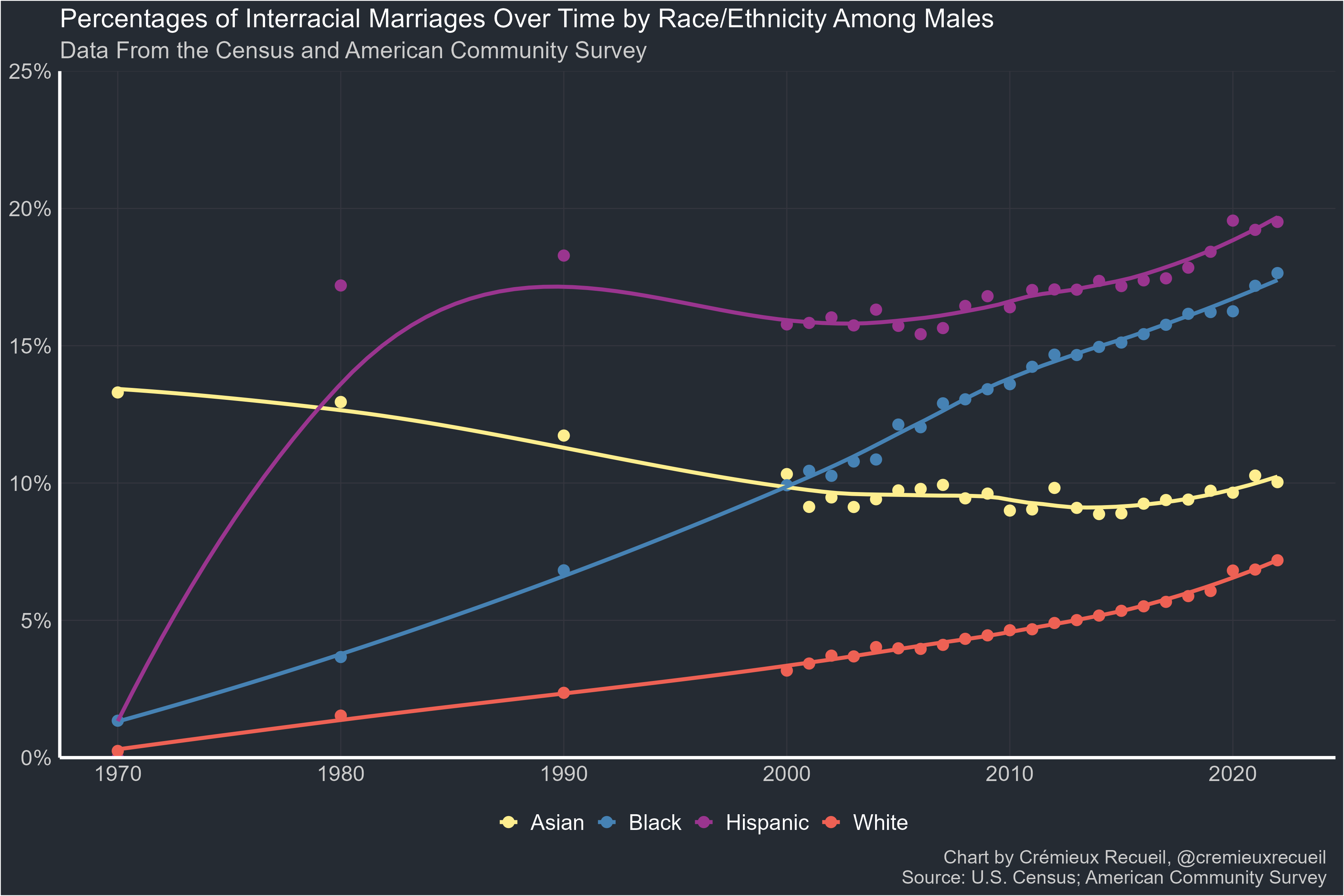
Here is a plot of male interracial marriage rates over time:
Here is a plot of male newlywed interracial marriage rates:

Here is a plot of female interracial marriage rates over time:

Here is a plot of female newlywed interracial marriage rates:

Who Marries Whom?
It is interesting to see who marries whom in terms of race and sex matching. Each of these plots is given as a percentage of all marriages within a race and sex combination.
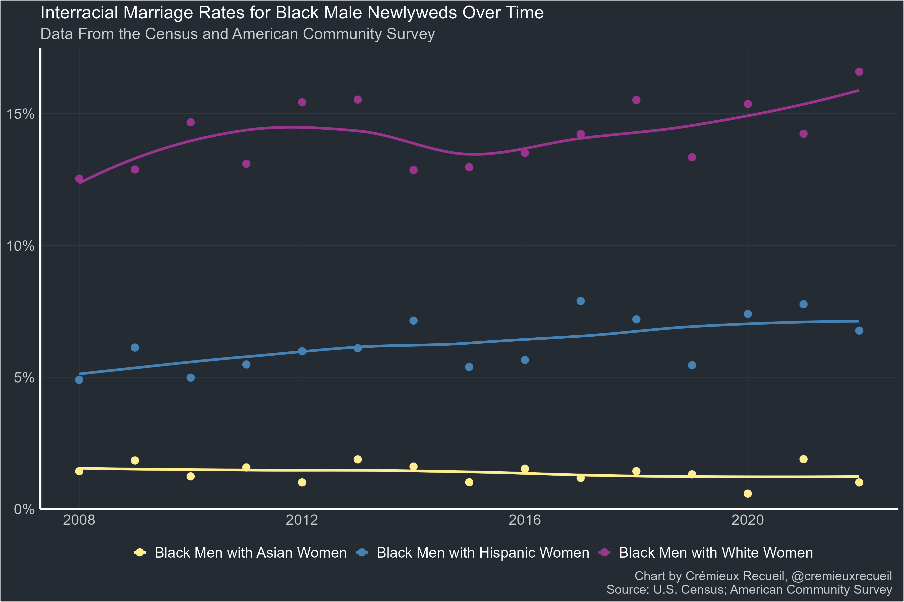
First up, we’ll look at who Black men interracially marry.

Next, we’ll look at who Black women interracially marry.

After that, we’ll look at who Asian men interracially marry.

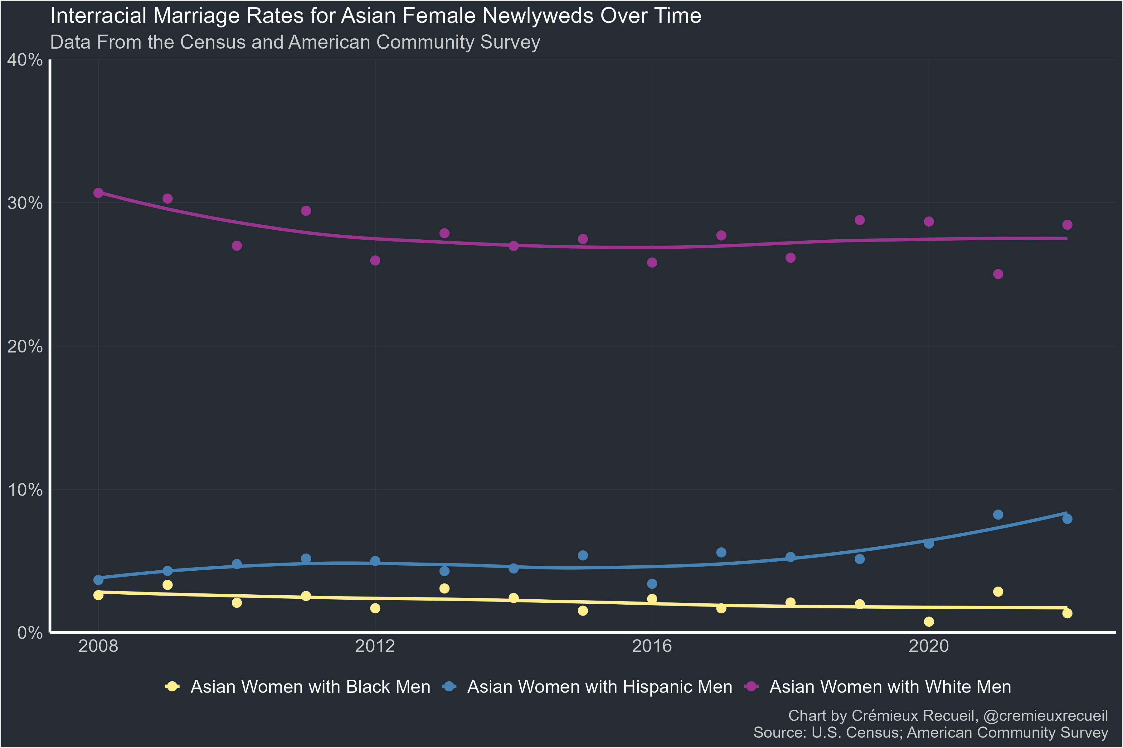
Then, we’ll look at who Asian women interracially marry.

Next, we’ll see who Hispanic men interracially marry.

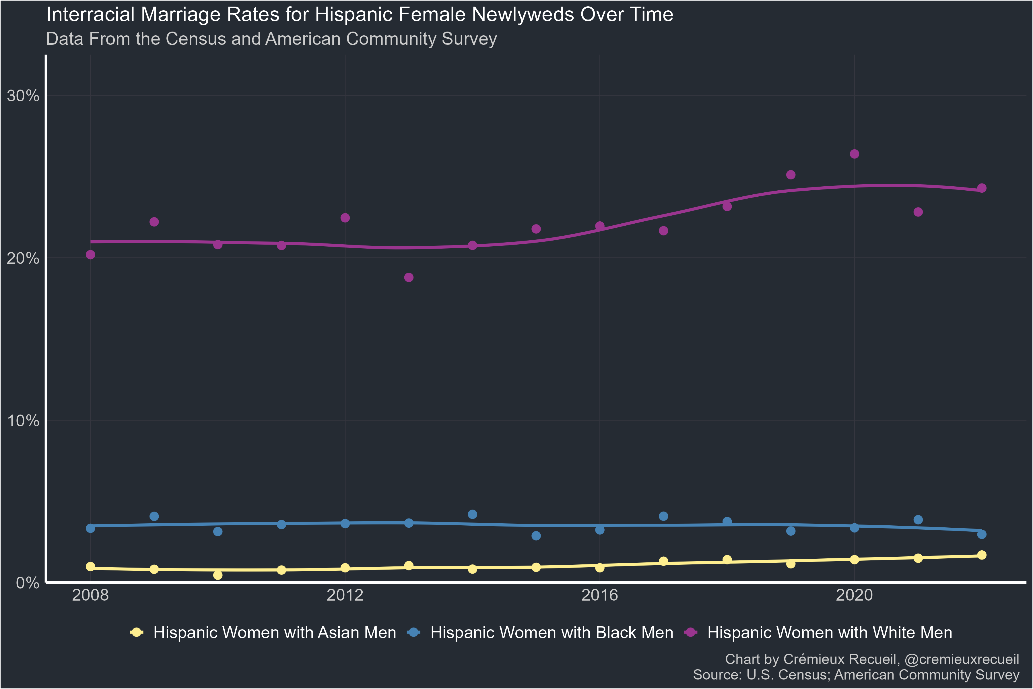
Then, we’ll look at who Hispanic women interracially marry.

Next, we’ll look at who White men interracially marry.

Finally, we’ll look at who White women interracially marry.

Who Marries Whom Among Newlyweds?
Now let’s look at newlyweds, people who married within the last year.
First up, we’ll look at who Black men interracially marry.
Next, we’ll look at who Black women interracially marry.

After that, we’ll look at who Asian men interracially marry.

Then, we’ll look at who Asian women interracially marry.
Next, we’ll see who Hispanic men interracially marry.

Then, we’ll look at who Hispanic women interracially marry.
Next, we’ll look at who White men interracially marry.

Finally, we’ll look at who White women interracially marry.

The Big Picture
The 10,000-foot view is that interracial marriage rates are up since it was legalized everywhere. You can see this for all interracial marriages:

And you can see this for newlywed interracial marriages:

Who’s Not Married?
This section shows percentages who have never married in any sense, so we can get an idea of the effect this has on interracial marriage rates.
Instead of being weighted by the HHWT, these results are weighted by the PERWT. This is based off of value 6 of the variable MARST, “Never married/single.” No additional adjustments were made, so this result remains confounded by age to the extent the PERWT fails to adjust for it. If there’s enough demand for a desired age correction or constraint, I can post it.
For males, the not-yet-married proportions over time look like so:

For females, the not-yet-married proportions over time look like so:

Potential Future Analyses
Some have suggested that the native Black interracial marriage rate has declined due to falling marriage rates in general, and that the recent increases are driven by immigrants. This has some plausibility, so if there’s demand, I can test it along with other immigration-related hypotheses.
To explicitly test the effect of declining total-population marriage rates, I can quantify that in different ways and assess total population-weighted changes in interracial marriage rates for each sex and race combination if there’s demand.
If more granular ethnic breakdowns are desired, I can plot those as well. The last time someone did that, of which I am aware, was when Twitter user @tcjfs produced these two plots from the ACS data in 2018:

And:

It would be straightforward to examine the geography of intermixing and to investigate results for cohabiting couples too.
Finally, it might be interesting to see how individuals belonging to different traditionally-recognized racial combinations (i.e., mixed Black-White, “Mulatto”, Asian-White, “Hapa”, or American Indian/Hispanic/Indio-Black, “Zambo”) marry with respect to race. The question remains open: as in “pure” groups, do mixed people practice endogamy along ethnic, racial, or other identity lines? If there’s enough demand, I can pursue this as well.
Analyses Like This One
Livingston & Brown (2017): This analysis for Pew yielded similar results to my own, but with somewhat—although not remarkably—different numbers. Among their findings, they observed the same pattern of intermarriage rates split by sex, that the newlywed rate exceeded the total rate among the married, etc. They also found that individuals with greater levels of education were more likely to intermarry and that there has been a dramatic decline in Asian intermarriage rates due entirely to those educated at the high school level or below. This presumably has something to do with immigration.
Hernandez & Hemez (2023): This analysis for the U.S. Census Bureau showed much higher rates of intermarriage and intermixing among homosexuals than among heterosexuals. The most notable finding in that article may have been the one showing that the gap in scale between married and unmarried interracial couple proportions. Among homosexuals in 2022, they found that 30.8% of marriages were interracial and 34.1% of unmarried homosexual couples were interracial; among heterosexuals, however, 28.6% of the unmarried were interracial and just 18.6% of the married were. Thus, the dating-marrying gap is much larger for heterosexuals than for homosexuals.
Washington (2023): This analysis for a presentation at the Population Association of America showed major geographic variation in the proportions of households with Black-White cohabiting and married households.
The top-five examined counties in terms of numbers of Black-White married couples as a percentage of all households in 2017-21 were found to be D.C. (2.42%), Marion, Indiana (2.28%), Jackson, Missouri (2.25%), Anne Arundel, Maryland (2.15%), and Milwaukee, Wisconsin (2.08%). The lowest five counties were Santa Clara, California (0.37%), Miami-Dade, Florida (0.33%), Bergen, New Jersey (0.33%), Utah, Utah (0.26%), and Hidalgo, Texas (0.03%). In 2007-11, 41% of Black-White married couples resided in the South region, and in 2017-21, that proportion had increased to 44.6%, likely due to greater increases in absolute intermarriage rates in that region since Blacks are much more common there than elsewhere.
Washington’s analysis also showed that Black-White interracial marriage is becoming less socioeconomically negatively selected over time. In 2007-11, 27.9% of Black-White cohabiting households were considered poor, compared to 21.4% in 2017-21. Simultaneously, 71.5% of Black-White cohabiting households in 2007-11 had no college educations for either partner, compared to 62% in 2017-21. Some part of this likely had to do with age, as cohabiting couples in this group, as with other racial combinations, skewed young.
Among the married, negative selection was always less severe and it trended similarly with cohabitation. In 2007-11, married Black-White households had a 6.4% poverty rate, compared to 4.8% in 2017-21. In 2007-11, 56.2% of them lacked any college education, compared to 45.9% in 2017-21. The age demographics of Black-White marriages were skewed older than the norm, and, for more obvious reasons, much older than the age demographics of cohabiting Black-White couples. In 2007-11, 30.9% of Black-White marriages involved a householder older than 50 years of age, compared to 38.4% in 2017-21.
Each of these analyses also used the American Community Survey.
A Strong Test of the Impact of the Great Awokening
If the "Great Awokening” or “Great Racial Reckoning”, or whatever you wish to call it had a major impact on race relations in the U.S., this is about the hardest metric on which it could have shown up. It’s reasonable to posit that, if people really were feeling more racial tension, interracial marriage rates should have declined as a result.
That was not at all evident in the data.
The trajectory for America’s ethnoracial composition remains one that is more mixed than it has ever been, more akin to a Latin American country than a European one. Although, it should be noted, Europe’s indigenous population is also rapidly aging and mixing at as-yet unforeseen rates so the analogy may have to change to a comparison with countries like China and Japan.
Mandatory IPUMS Citation
Steven Ruggles, Sarah Flood, Matthew Sobek, Daniel Backman, Annie Chen, Grace Cooper, Stephanie Richards, Renae Rogers and Megan Schouweiler. IPUMS USA: Version 14.0 [dataset]. Minneapolis, MN: IPUMS, 2023. https://doi.org/10.18128/D010.V14.0
Note that these laws were never applied to bar marriage between European ethnicities, like the Irish and settler-descended Anglo-Americans. Those who claim that groups like the Irish, Italians, and Finns were once considered to be non-White and have since assimilated to a White identity have to contend with this strong contrary fact.
df <- df %>%
  filter(RACE_CONSISTENT %in% c("White", "Black", "Asian", "Hispanic")
)This pattern is preserved with the 1970-2007 data as well, so it is not dependent on a recent surge in interracial marriages.
"It would be straightforward to examine the geography of intermixing and to investigate results for cohabiting couples too."
In conjunction with what you have given us here, I think the cohabiting couples (and geography) would definitely be interesting. In addition, since the topic is, broadly, that of Americans mixing, are there any good ways to look at the parentage of children or what percentage of Americans have had a relationship outside of their race?
Thanks for all your work, it is always interesting and well presented, even if I have to smash my head on the desk to remember the stats and R programming I learned in the distant past.
Your percentage of women never-married by race differs sharply from that reported in these links by the Census. What do you think that is?
For example, the following chart shows that the percent of never-married women has increased from about 20% to 30% from 1970 to 2020: https://www.census.gov/content/dam/Census/library/visualizations/time-series/demo/families-and-households/ms-1b.pdf
You can see data by race based on Table MS-1 here: https://www.census.gov/data/tables/time-series/demo/families/marital.html.
For example, the spreadsheet shows that the never-married percentage among black women increased from 28% (2,248/8,108) in 1970 to 47% (8,709/18,339) in 2020, whereas your graph shows an increase from about 50% to 60% over the same time period.
One possibility is that your 2 "percentage of never-married" graphs contain people of all ages, including children, whereas the links I posted are limited to individuals aged 15 years or older (this would also explain why the never-married percentage decreased for some groups in your graphs whereas it increased for all groups in my links; over this time period, the adult-to-child ratio would have increased, which decreases the never-married percentage). You mention the results are "confounded by age", but it's not clear if that means it's unrepresentative or that it includes children. If the data includes children, I'm not sure how informative these 2 graphs are.