Ranking Fields by p-Value Suspiciousness
What proportion of reported p-values in your favorite field are between 0.05 and 0.01?
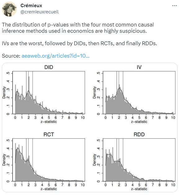
p-hacking is a pervasive problem in the sciences. It’s been the downfall of many a scientist and the source of many a pop sci article. Many people have analyzed this phenomenon and produced some pretty familiar graphs, like these:
Look and you’ll see a lot of results right around the conventional significance thresholds for p-values of 0.10, 0.05, and 0.01. This region between 0.10 and 0.01 is what psychologist Julia Rohrer has dubbed the “uncanny mountain”. For difference-in-difference and instrumental variables studies, their modes are located on the uncanny mountain, but this distribution of p-values is, frankly, impossible without cheating.
Assume you have a field with the commonly recommended power level of 80%. If all the effects pursued in that field were “real”, the z-values would be distributed like the yellow curve below:
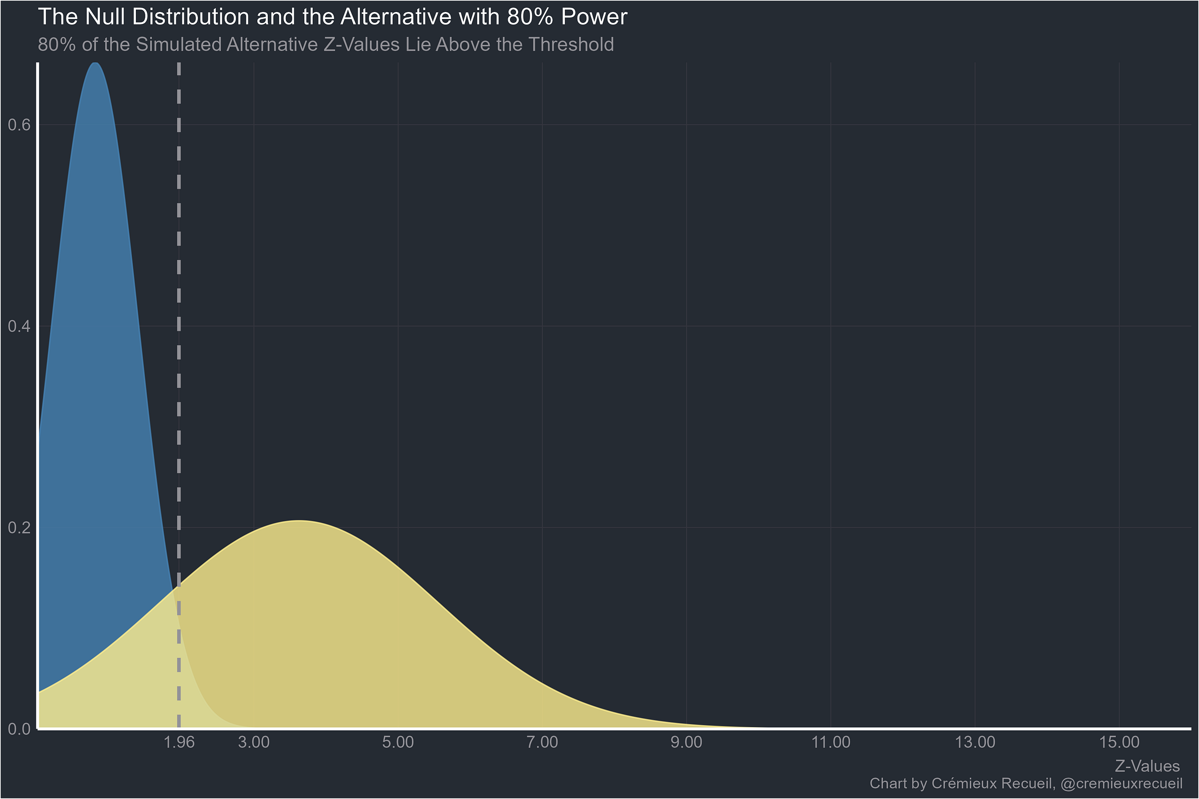
In fact, with this knowledge, we can calculate that at 80% power and with all real effects, 12.60% of results should return p-values between 0.05 and 0.01. Under the null hypothesis, only 4% would be in that range. But there are problems comparing this to the observed distribution of p-values. To name a few
Scientists are not perfect: they do not know that every effect they’ve hypothesized about is real. Because many effects are probably not real, there should be more nonsignificant values. The distribution of z-values must go left.
Many studies have more than 80% power for their target effects. These should have a distribution of z-values that’s shifted to the right if their effects are real.
Most studies have way, way less than 80%, much less 50%, or even 20% power. The real distribution of z-scores should be shifted way to the left. As examples, consider environmental science, where the median power is 6-12%, or neuroscience, where the median power is 8-31%, or economics, where the median power is 10-18%.
Publication bias means published p-values will be censored because there’s a preference for the publication of significant results. In rarer cases, there’s a preference for nonsignificant, usually underpowered results.
So with incredibly low power, what proportion of results should be between p = 0.05 and 0.01? The answer is very few unless you’re at 50% power, when around half of the significant results should be between 0.05 and 0.01. But most of the results at that level should actually not be significant.
The reason there are so many results between 0.05 and 0.01 is p-hacking: scientists know that these thresholds are important to other scientists, to editors, and to themselves after years of having it dinned into their brains that if the p-value is below 0.05, the result is real.
In the comments of that Twitter post, Hungry Brain author Stephan Guyenet asked what similar analyses of nutrition studies would look like.
Luckily, four relatively recent studies have provided large datasets including 3.62 million p-values from studies in the following fields: Pharmacological and Pharmaceutical Science, Multidisciplinary, Biological Science, Public Health and Health Service, Immunology, Medical and Health Science, Microbiology, Biomedical Engineering, Biochemistry and Cell Biology, Computer Science, Dentistry, Psychology and Sociology, Zoology, Animal, Veterinary and Agricultural Science, Complementary and Alternative Medicine, Education, Ecology, Evolution and Earth Sciences, Neuroscience, Genetics, Physiology, Chemistry and Geology, Plant Biology, Geography, Business and Economics, Informatics, Mathematics and Physics, Nutrition and Dietetics, Economics, Other and NA.
These studies were Jager & Leek (2013), Brodeur et al. (2016), Head et al. (2015), and Chavalarias et al. (2016). All of their data is publicly available, so I will use it to examine which fields produced the most suspicious results, omitting the entries for “Other” and “NA”.1
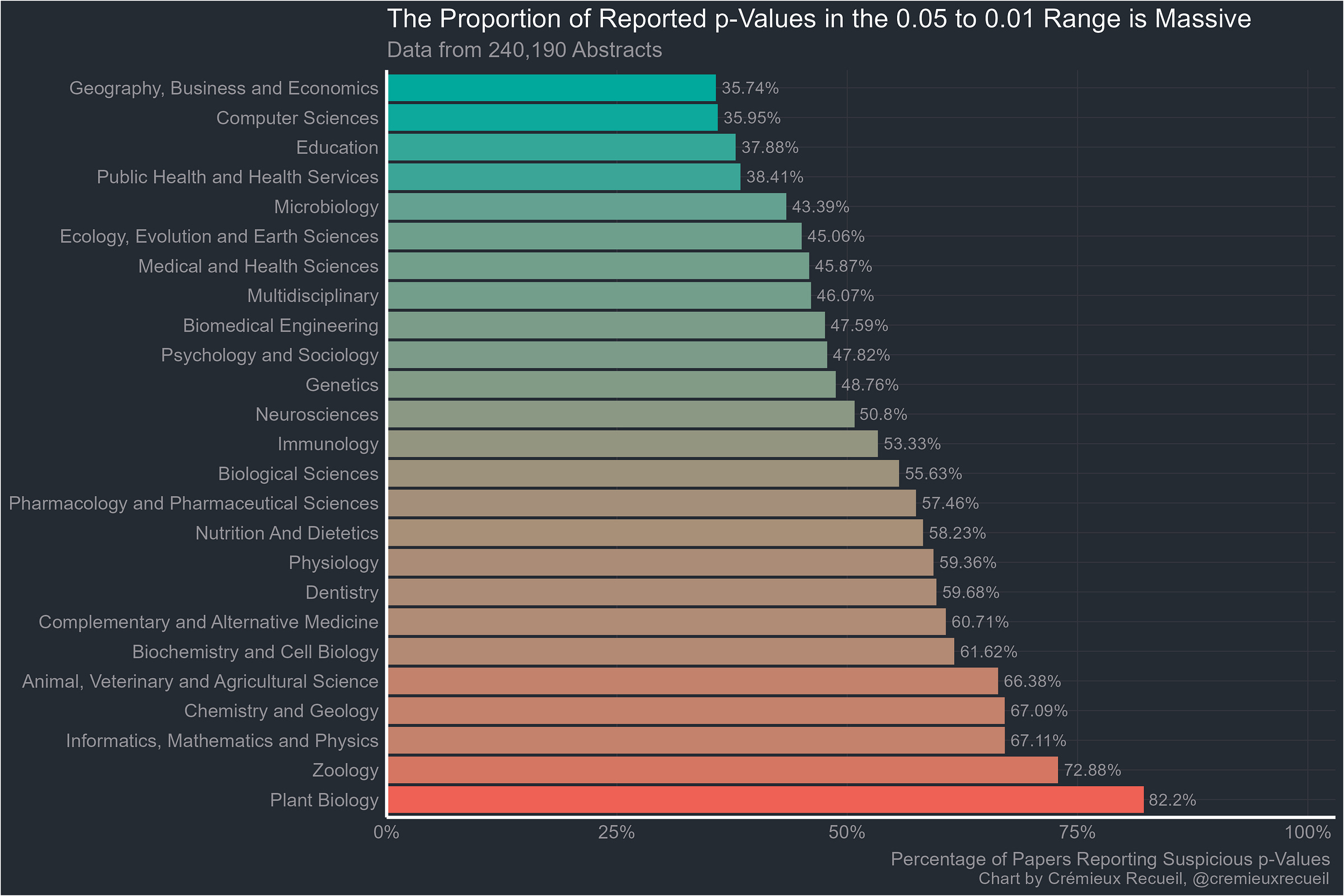
Let’s start with the abstracts. Scientists often present some of their flashiest results in the abstracts of their papers, where regardless of paywall status, the world can see them. We have data from the abstracts of 25/26 fields; data on abstracts in economics was not gathered. That field will have to wait for the full-text results.
Remember how most fields have low power and a field with 80% power should have 12.6% of its significant results between 0.05 and 0.01? Every field managed to beat that number, and I guarantee every one of these fields has less than 80% power. Since the proportions of each field’s results are overwhelmingly marginally significant like this, there is clearly something going on. But maybe it’s just that the main results are in the abstract and those results should be expected to be significant.
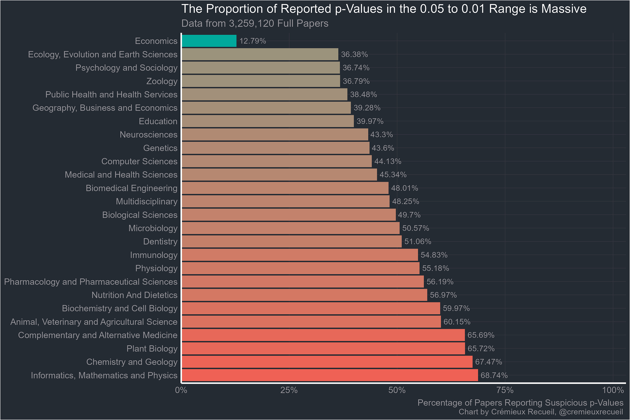
So on to the full-texts. These are p-values obtained from looking through thousands of full papers. Here’s how they looked:
Without economics, the rank correlation ρ between abstract bunching percentages and full-text bunching percentages is an extremely significant 0.69.
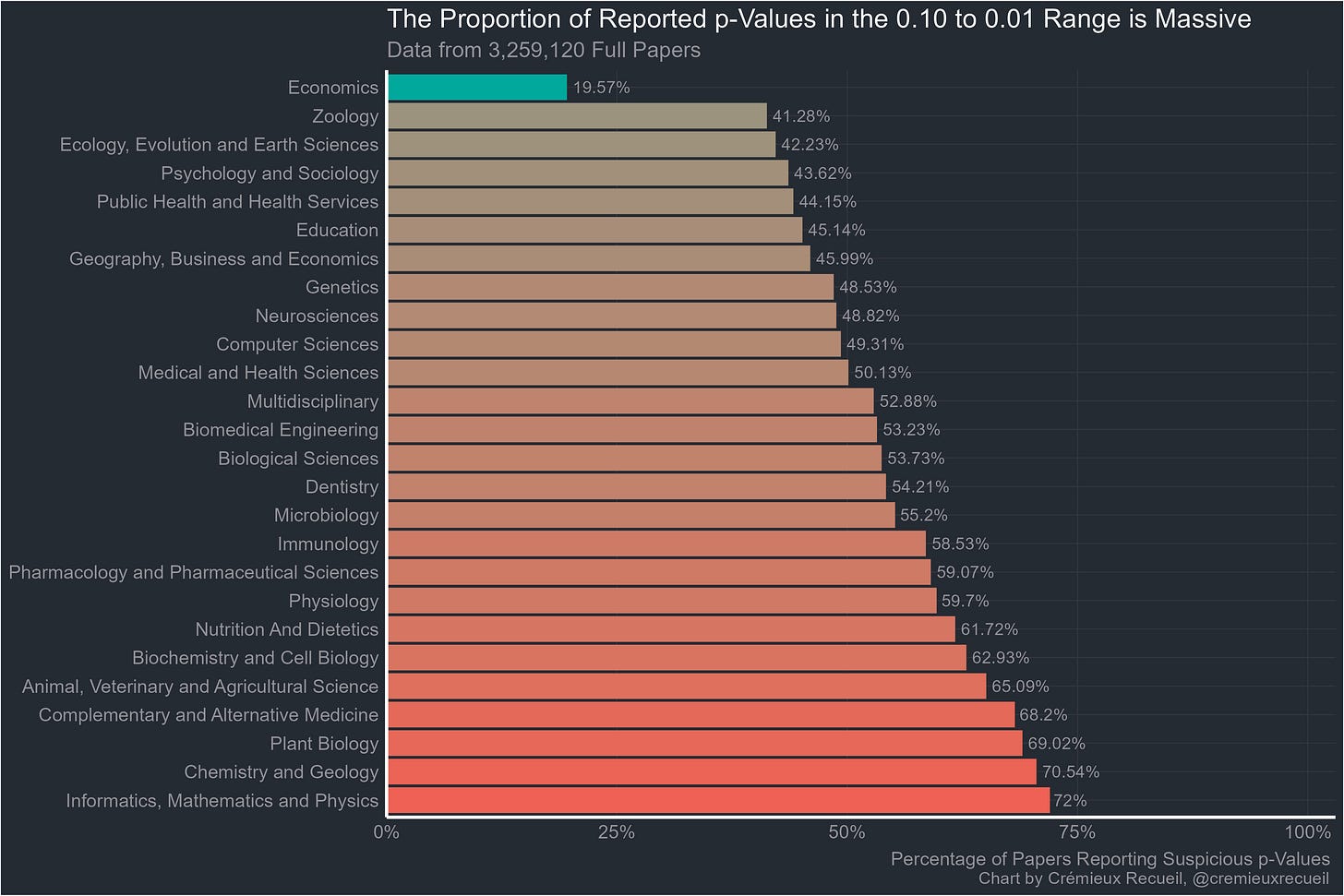
Now that it’s obvious, I should note that the suspicious-looking field that started this whole investigation is actually the best of the pack. It may have an excess of highly-suspicious p-values compared to what it would have if researchers were unbiased, but it’s still far better than the next most suspicious, and by god is it better than plant biology, chemistry and geology, or informatics, mathematics and physics.
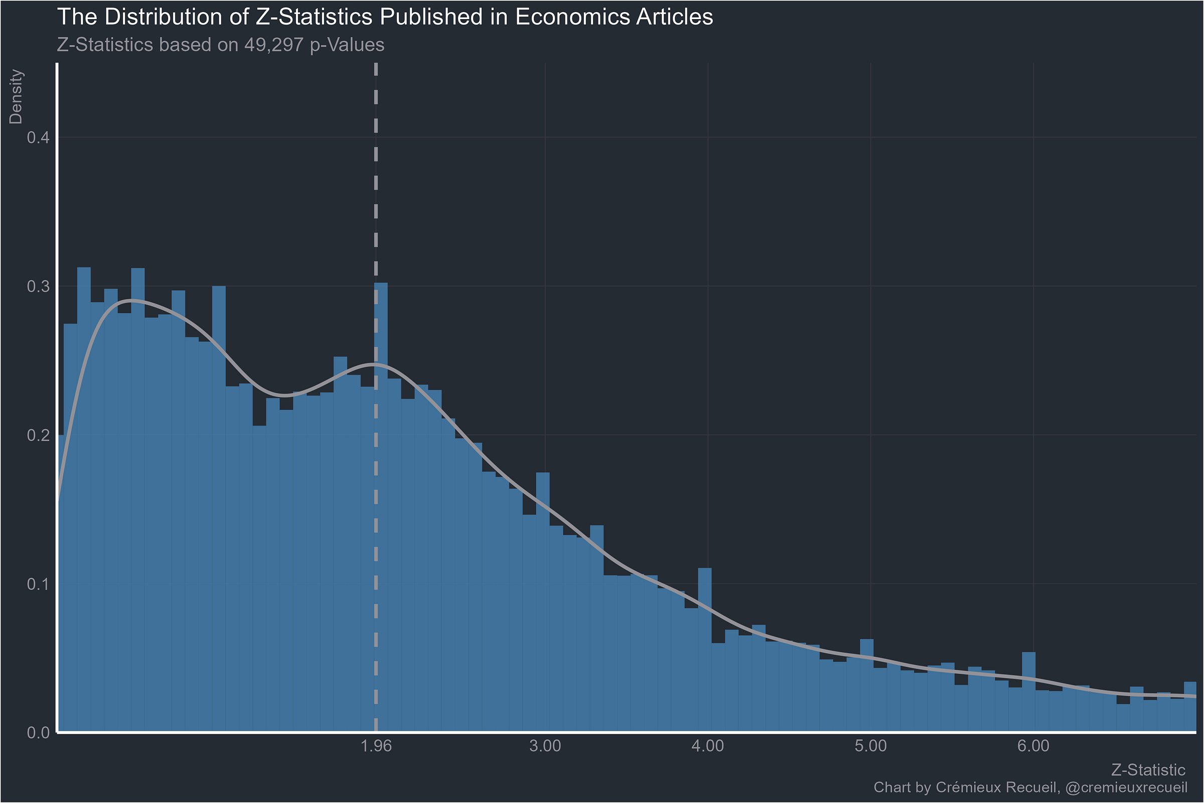
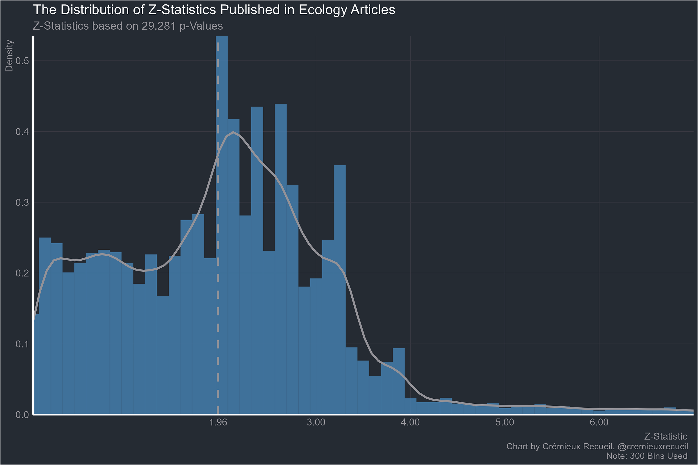
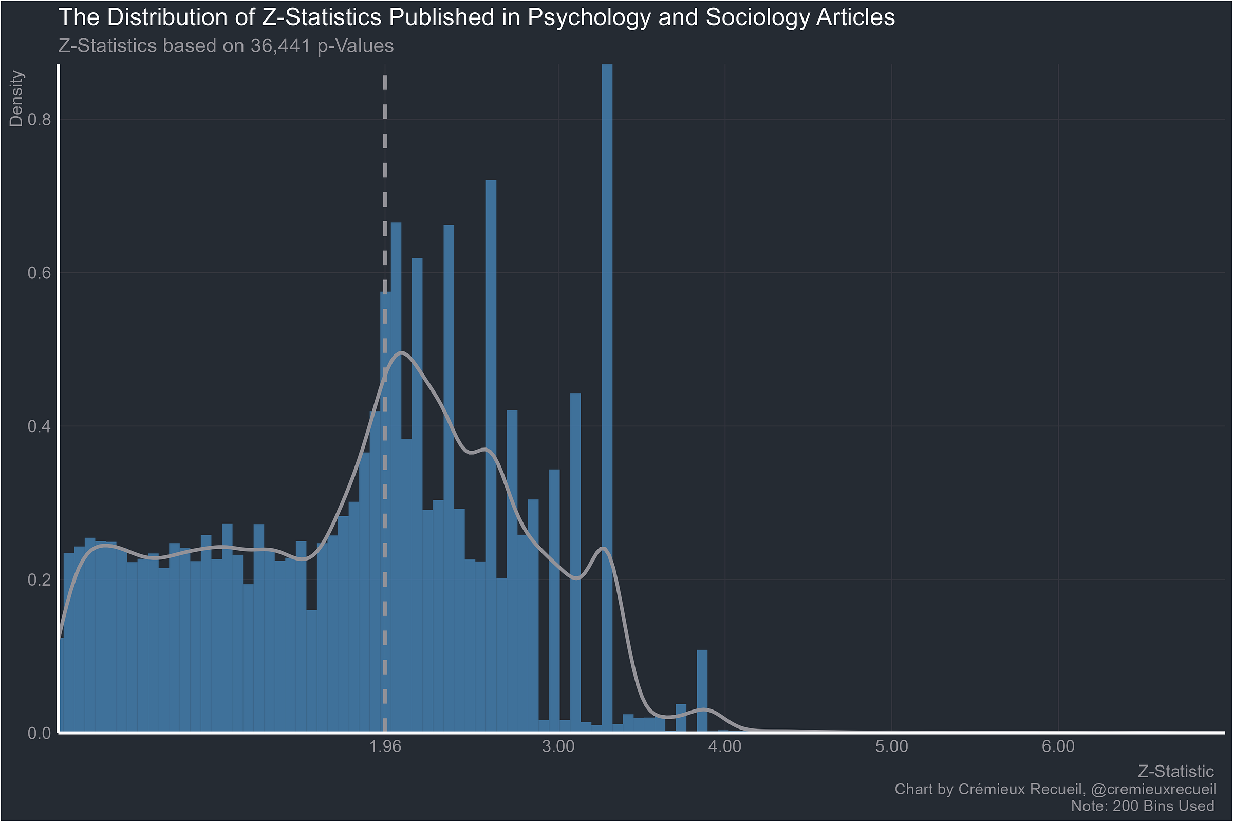
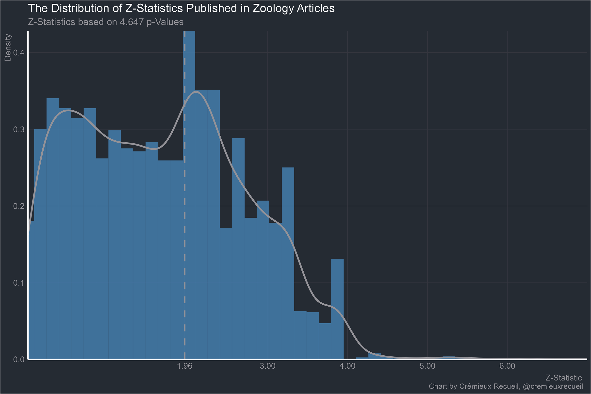
Let’s take a look at absolute z-value distributions by field.2
Starting with the familiar example from economics, things don’t look too bad, and they’re all worse than this. Some of them are much worse.
What about ecology?
Everyone’s favorites, psychology and sociology?
It pains me to go on, but what about zoology?
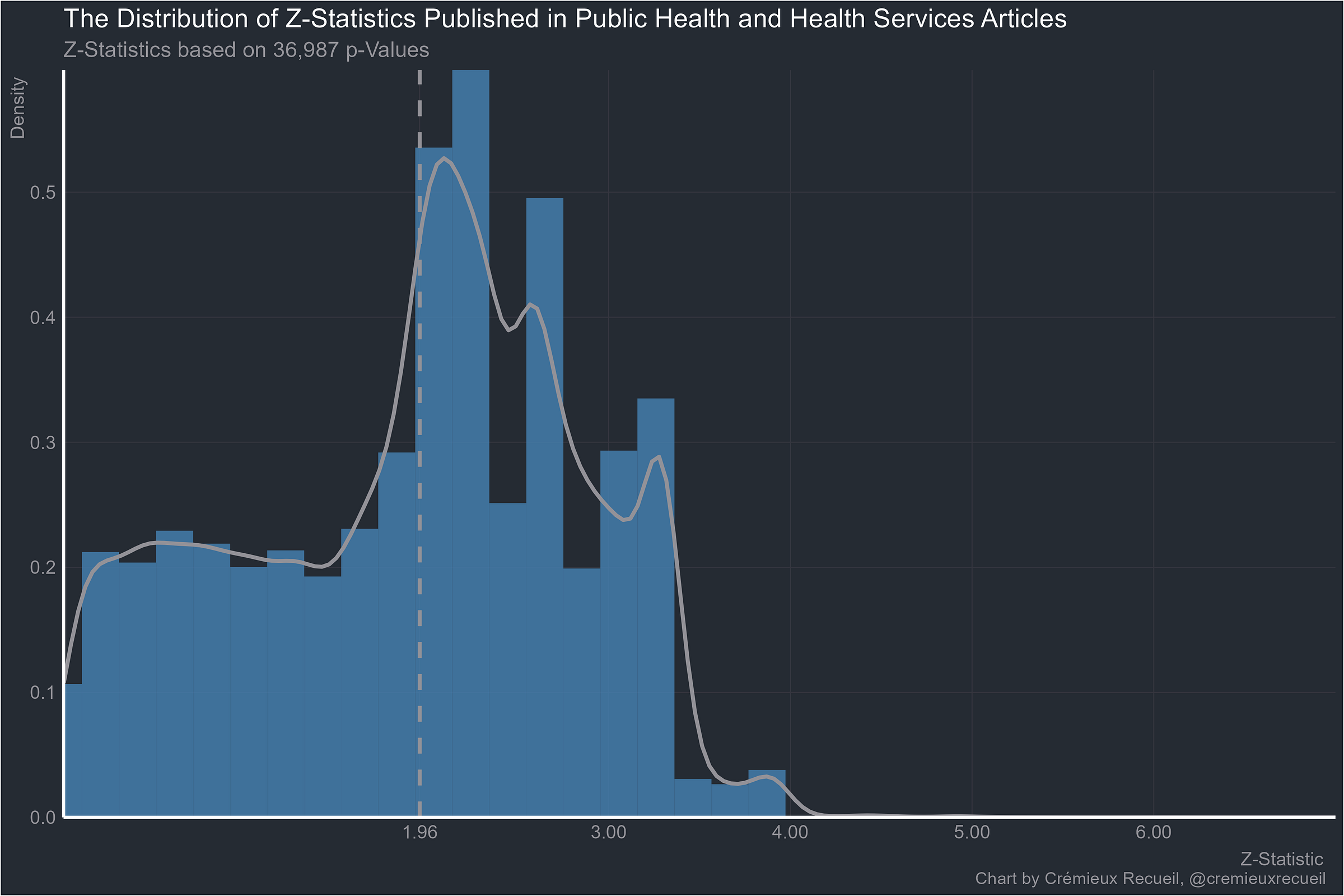
Public health and health services?
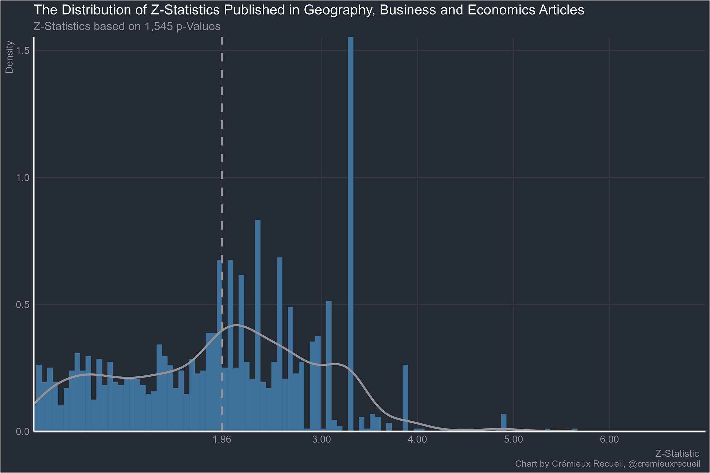
Given the results so far, I am really not surprised that these plots are so much rarer outside economics and medicine. But let’s keep going. Here’s geography, business and economics:
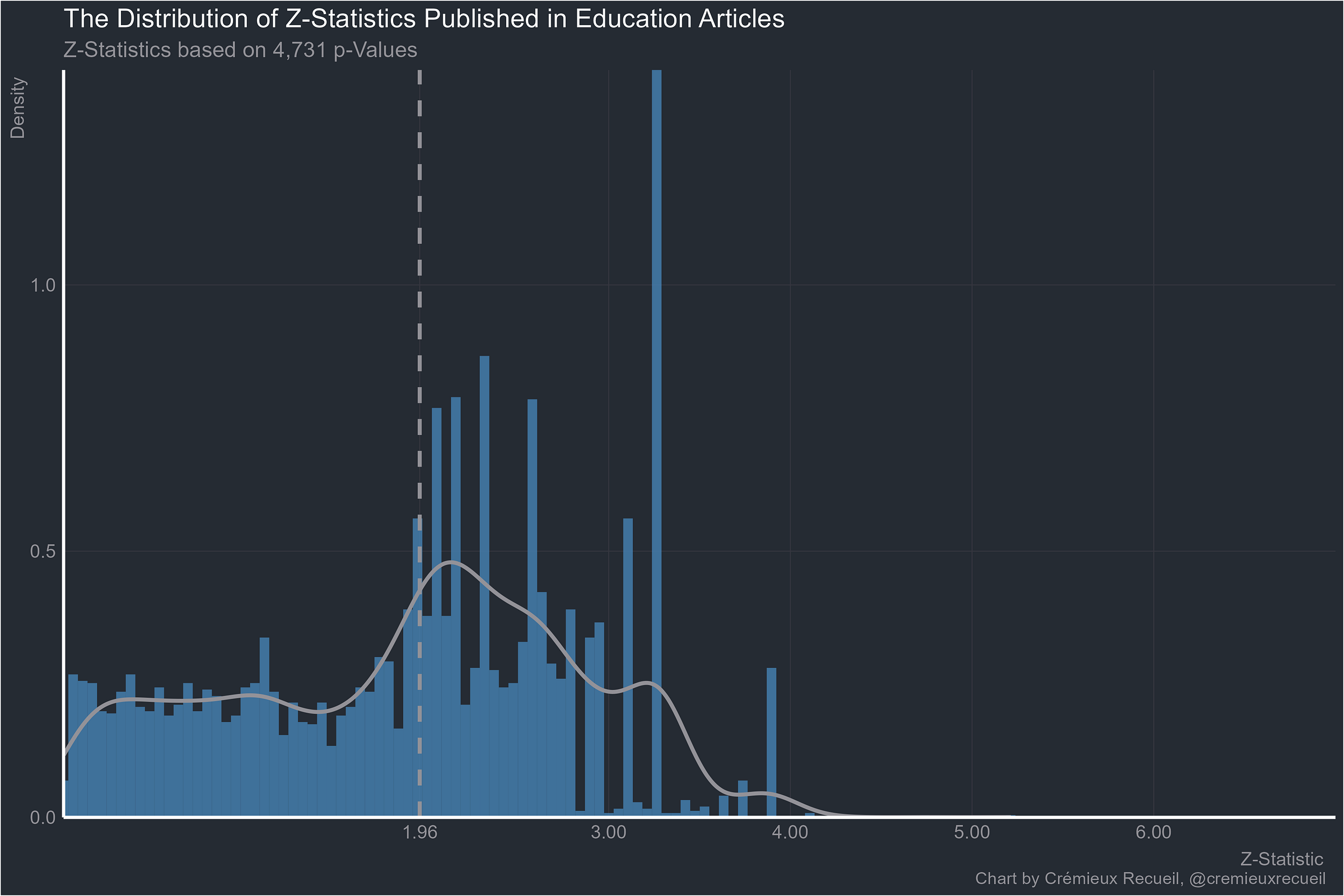
What about psychology’s backwater, education?
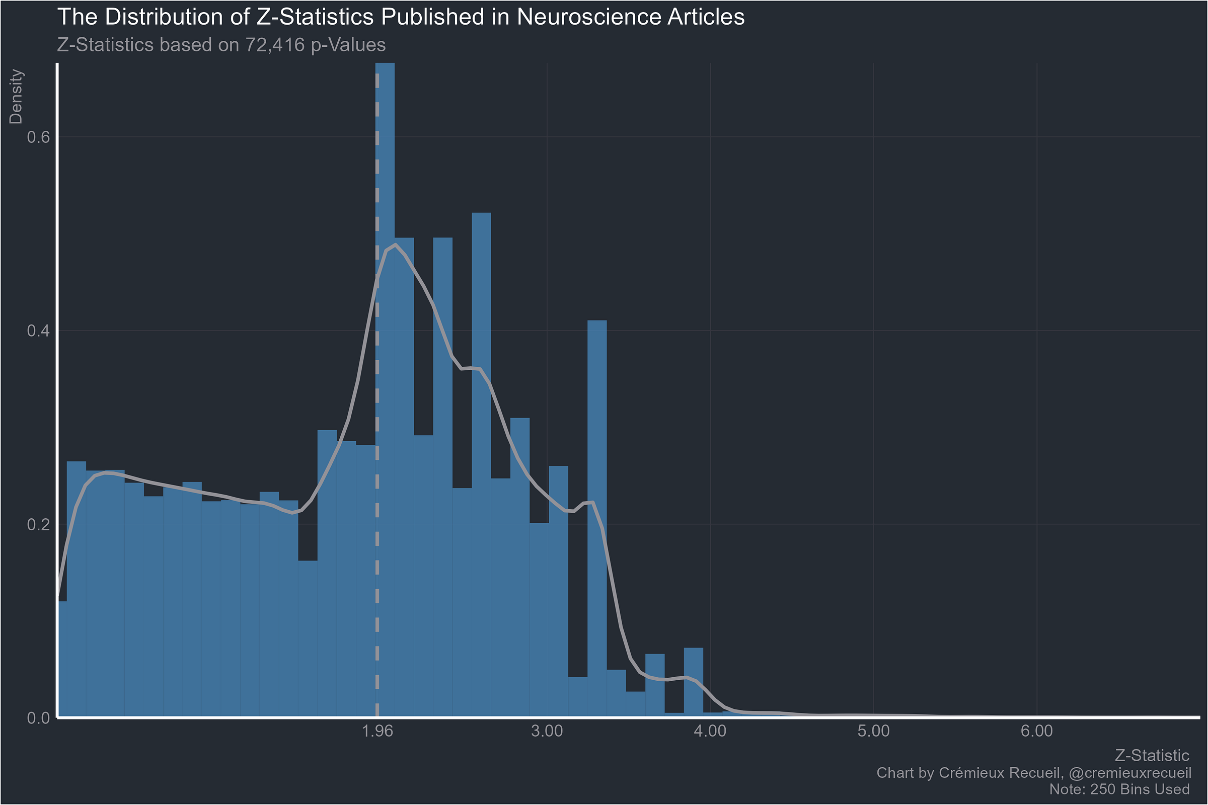
And the place where theories go to wow the uneducated and confound skeptics, neuroscience:
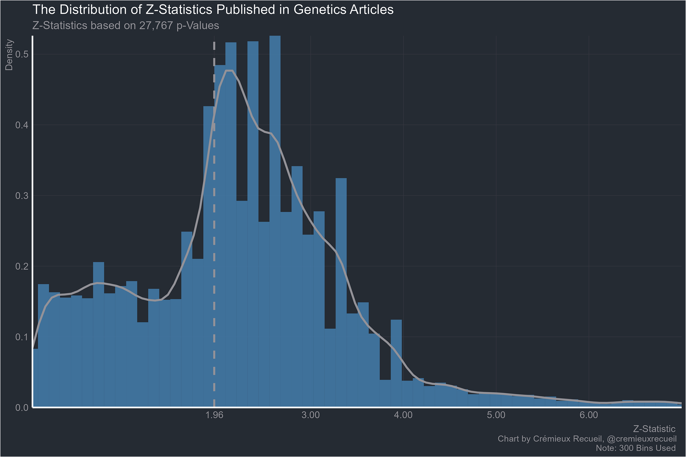
I actually find it hard to believe this one is worse than neuroscience, but let’s see genetics:
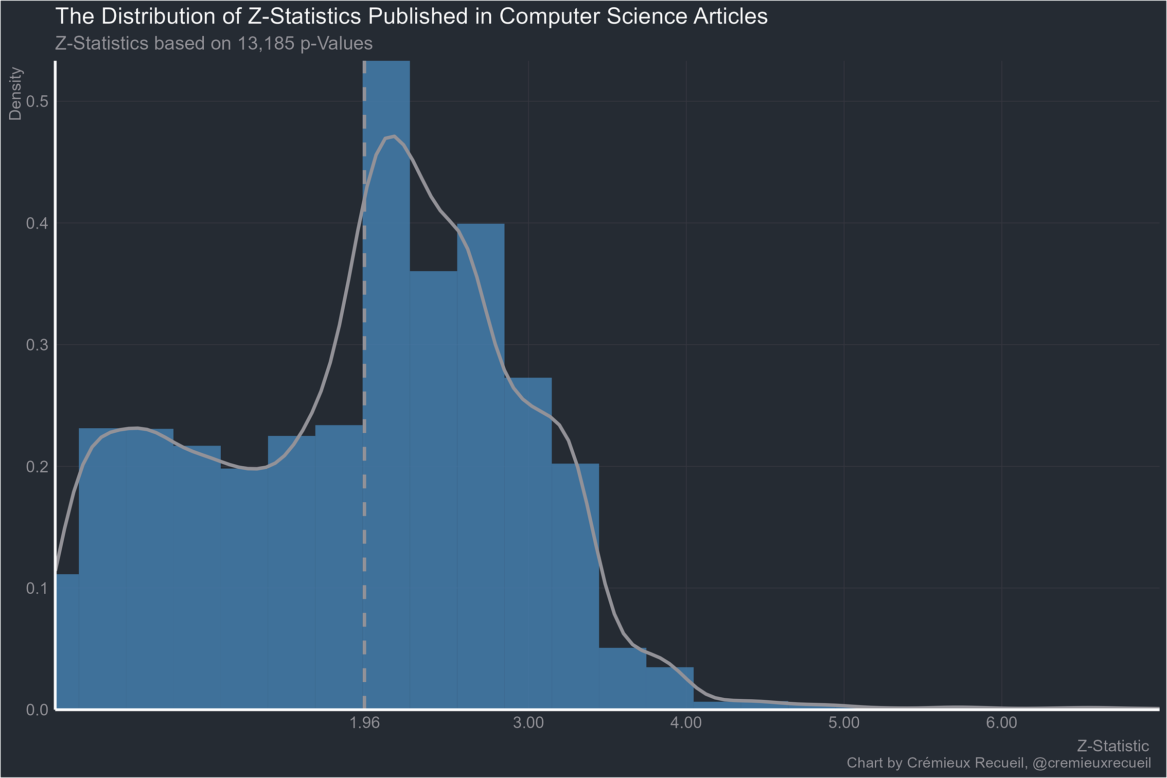
Now for computer science:
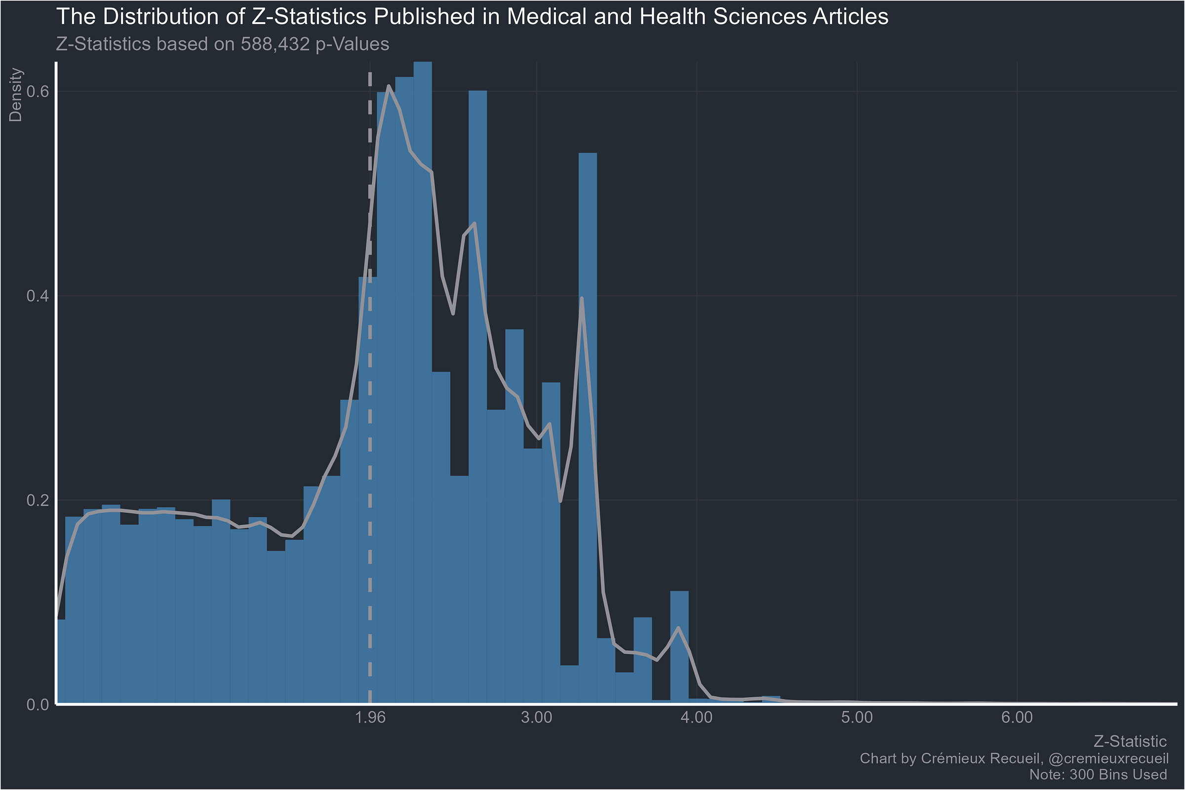
The big one, medicine:
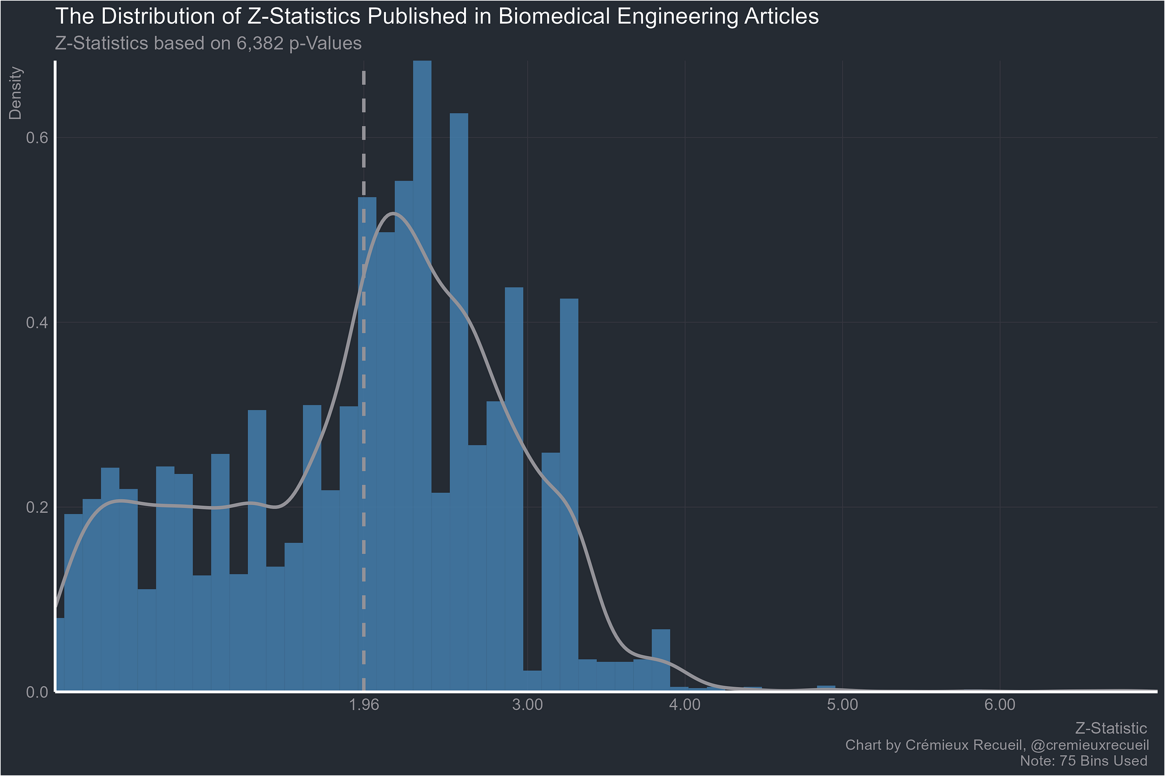
Biomedical engineering next:
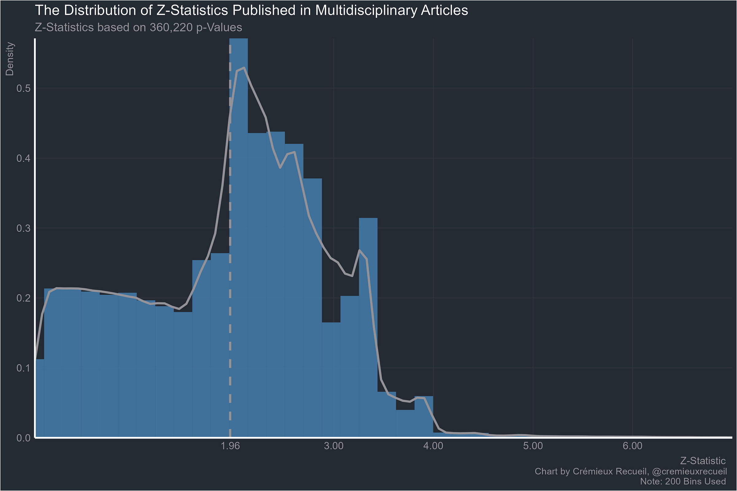
Multidisciplinary work, clearly not being protected by leveraging the benefits of multiple disciplines:
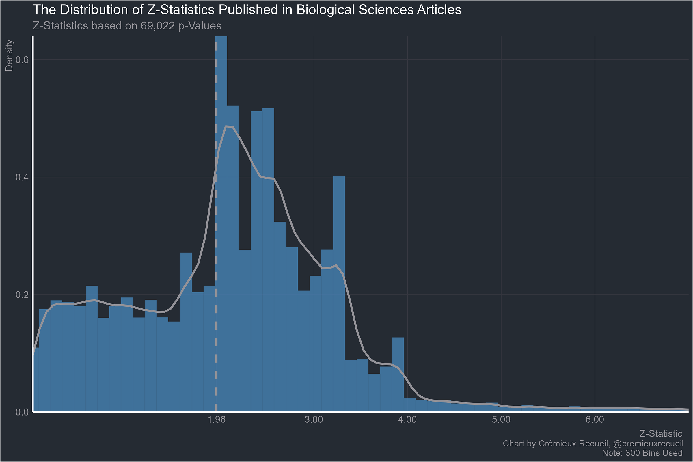
Onto the biological sciences:
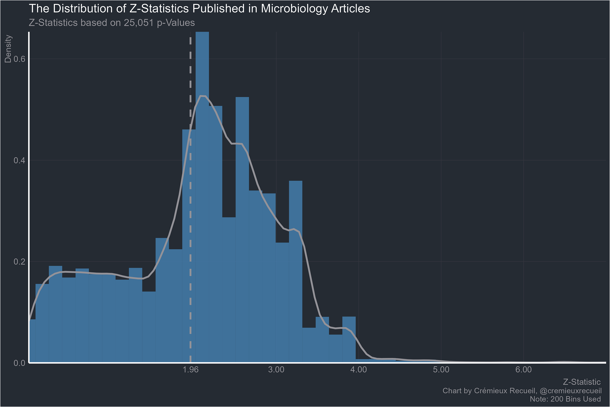
Going smaller, microbiology:
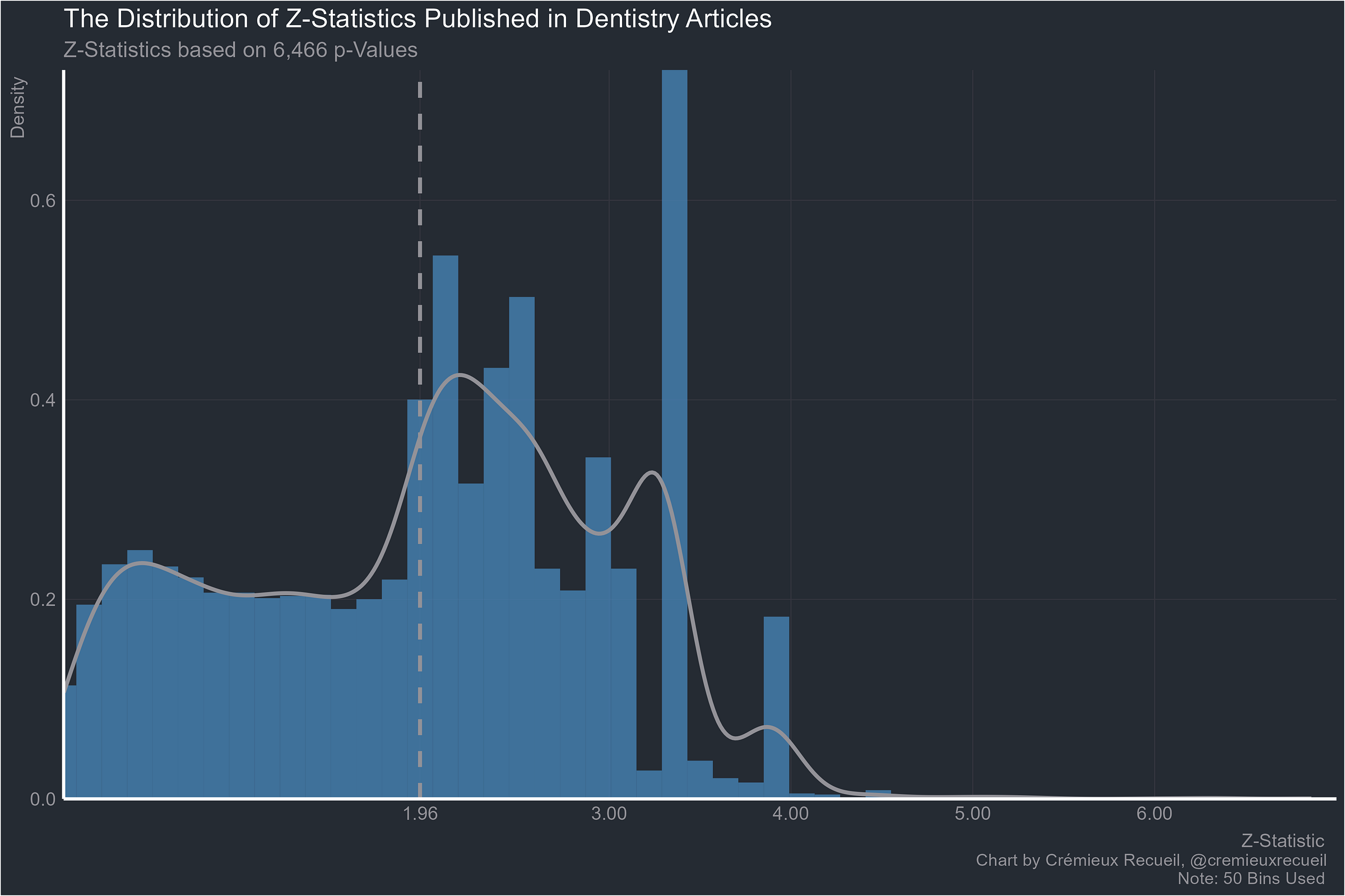
Dentistry:
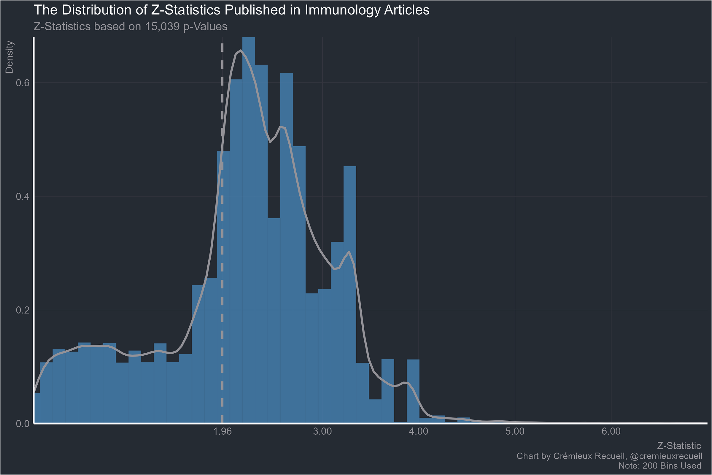
Immunology:
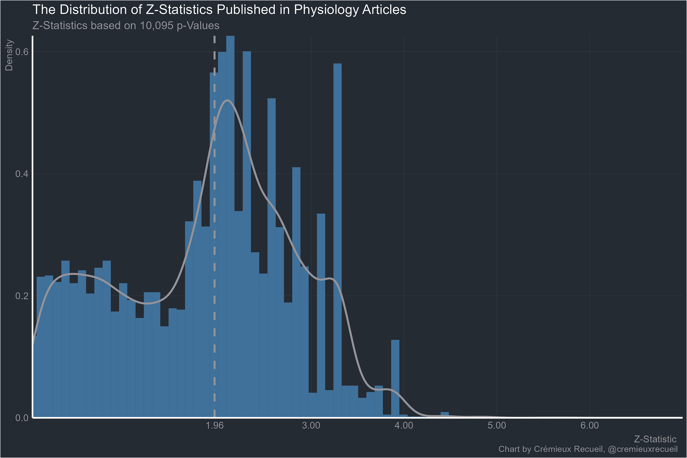
Physiology:
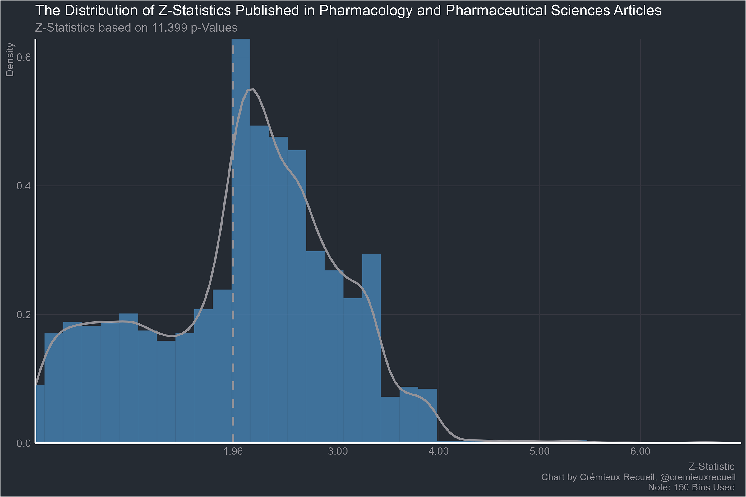
Pharmacology:
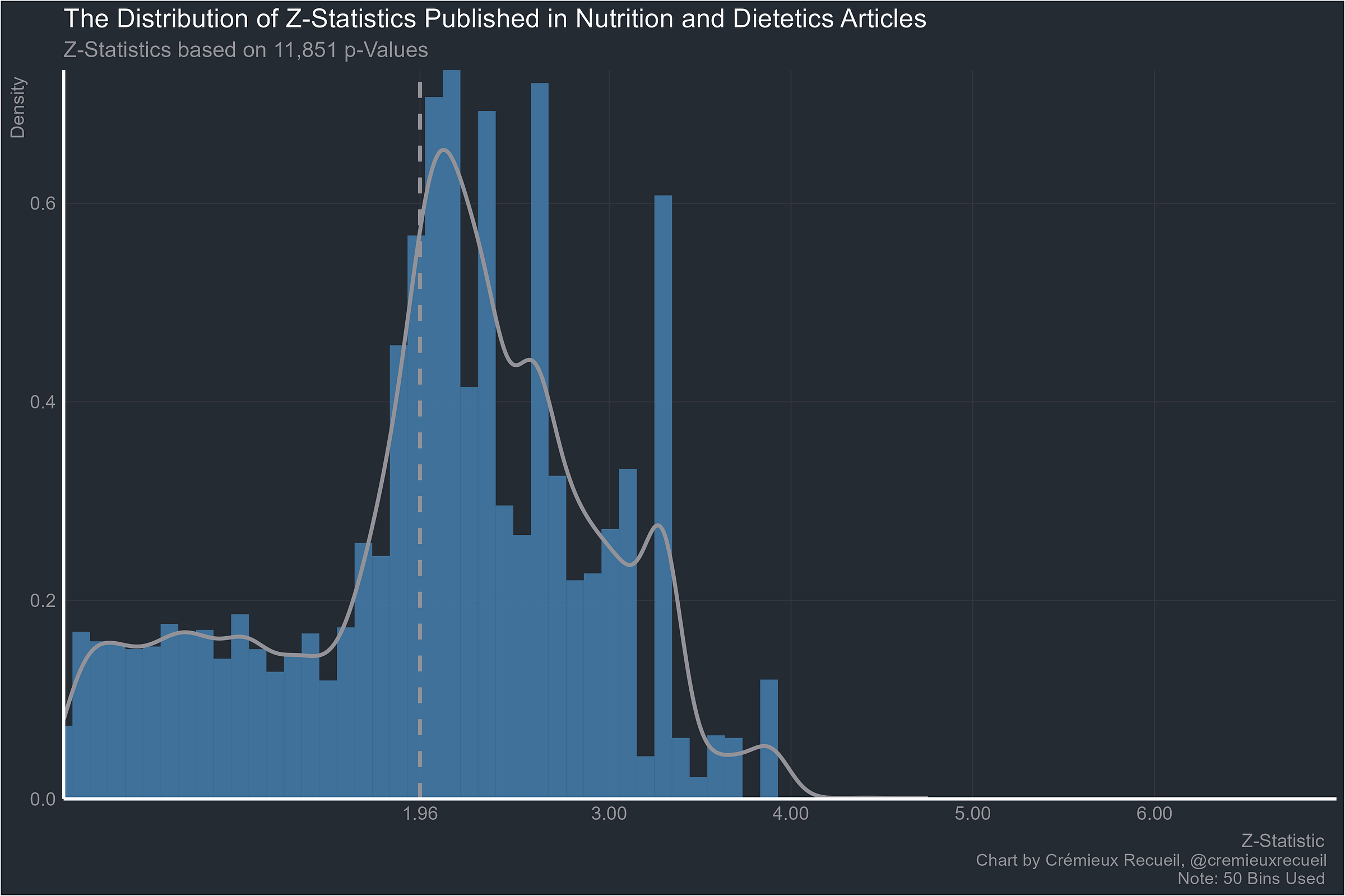
Stephan’s request, nutrition:
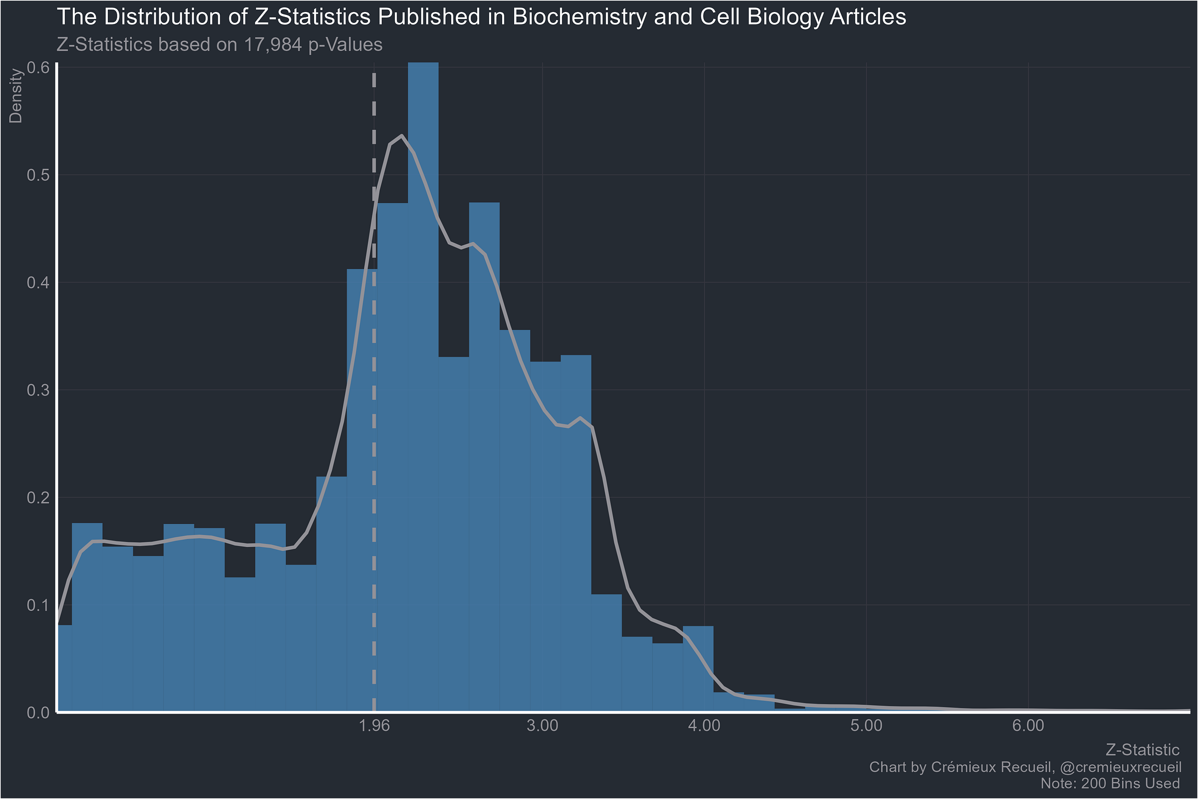
Biochemistry:
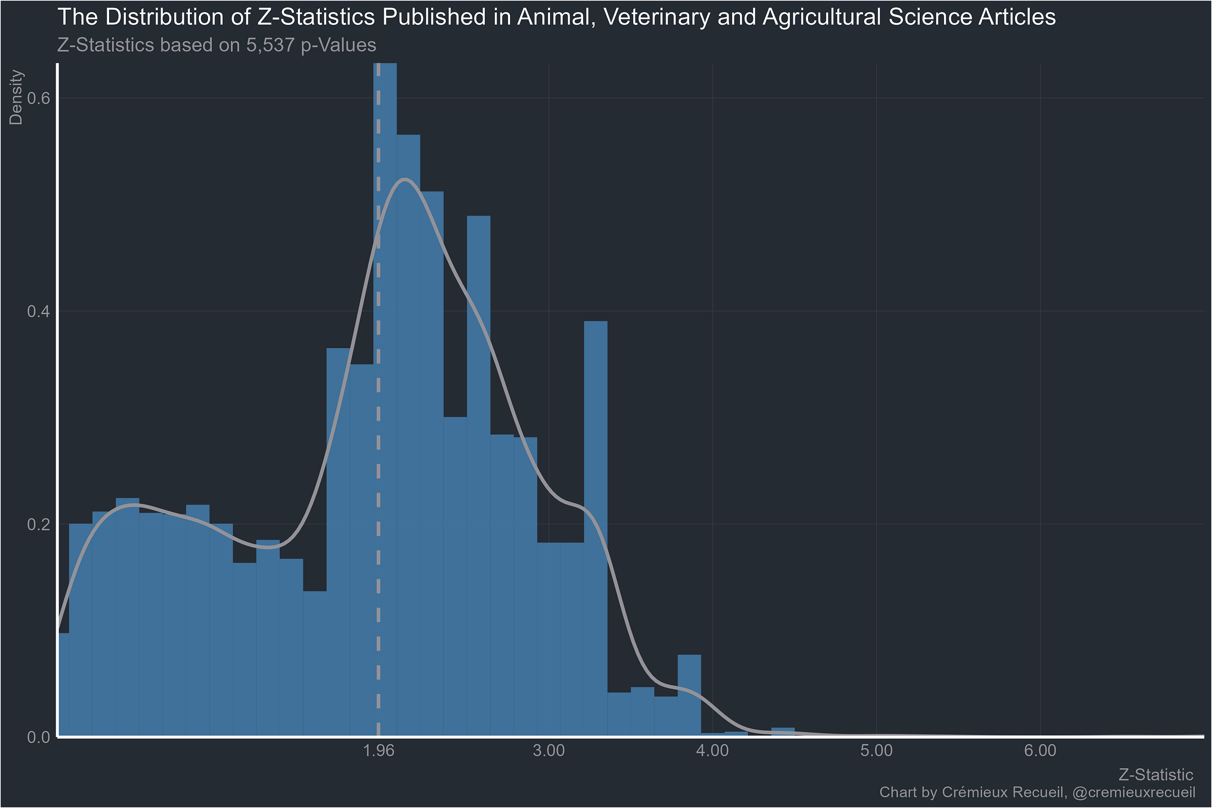
The animal sciences:
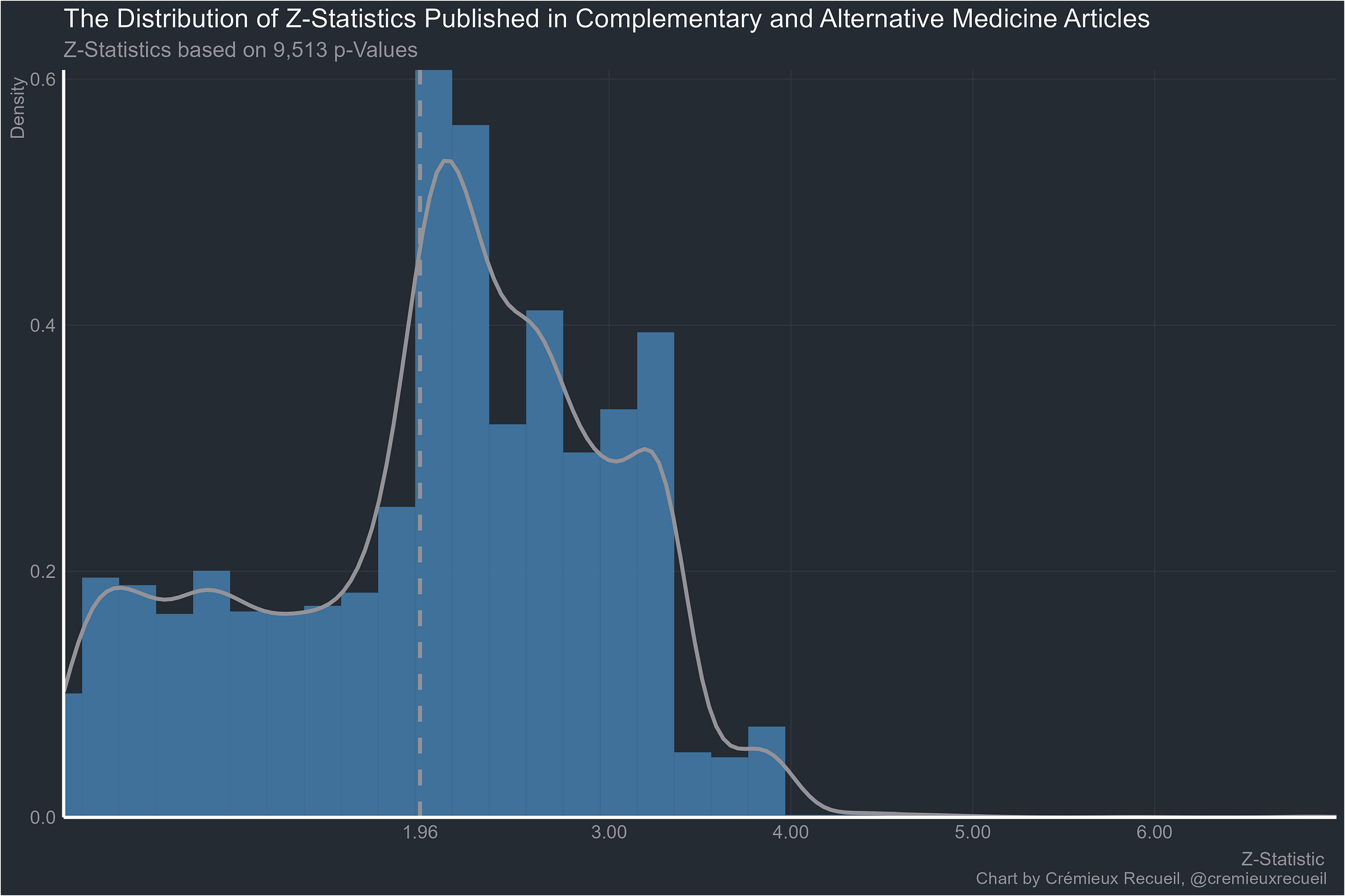
At least alternative medicine is worse than normal medicine:
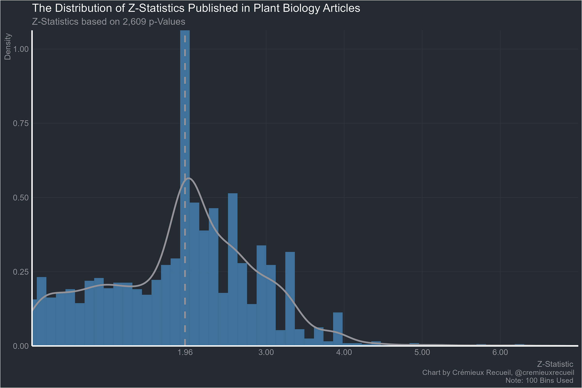
Plant biology:
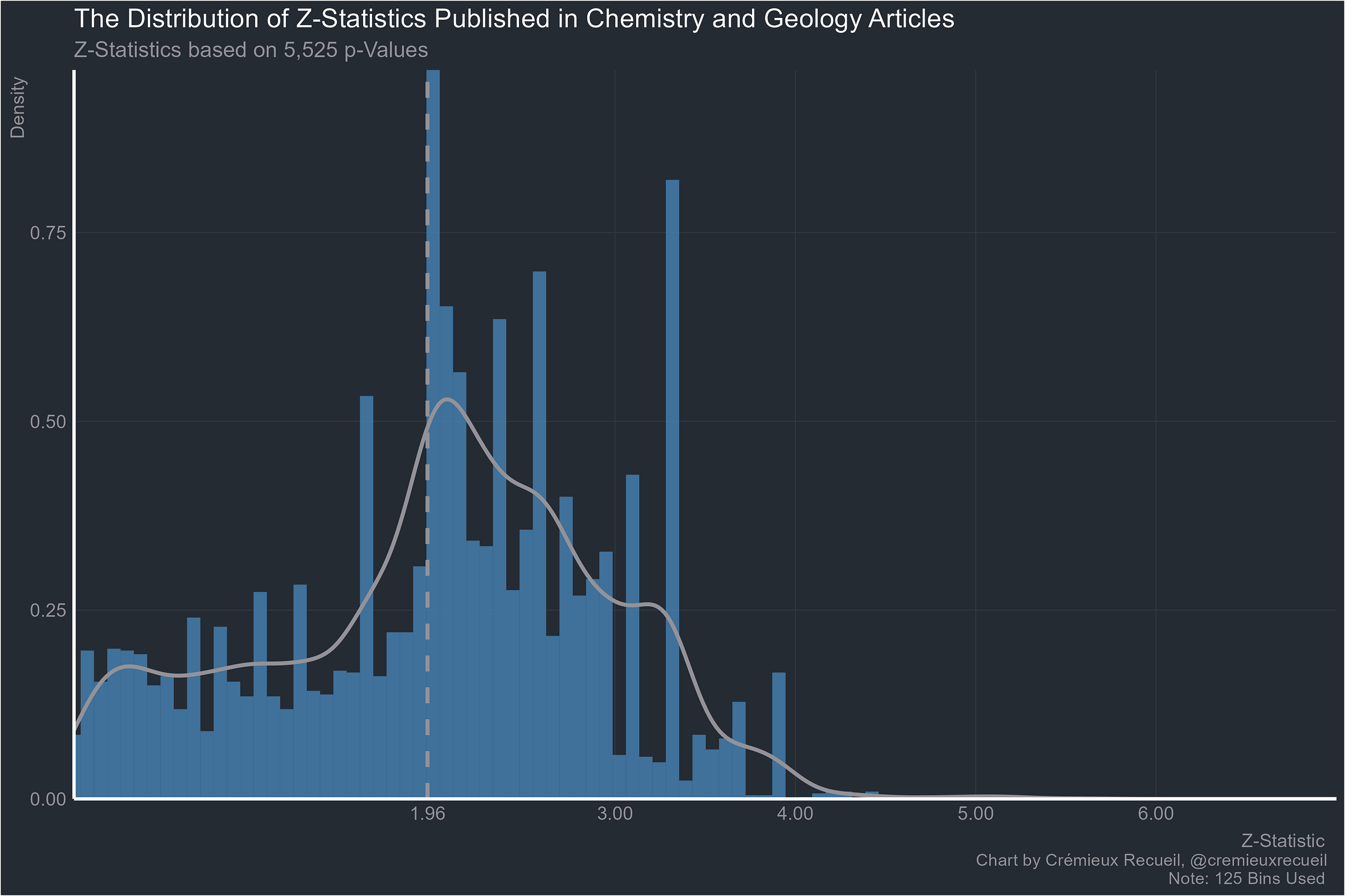
Chemistry and geology:
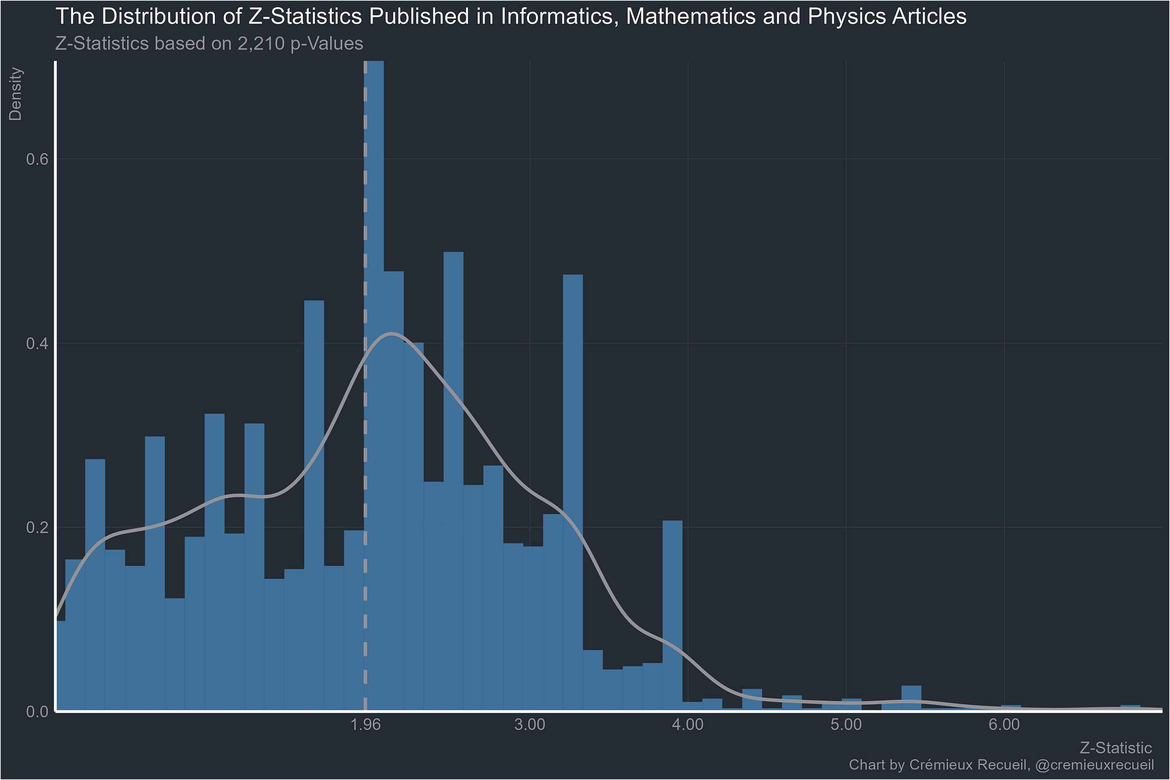
And finally, worst of all, informatics, mathematics and physics:
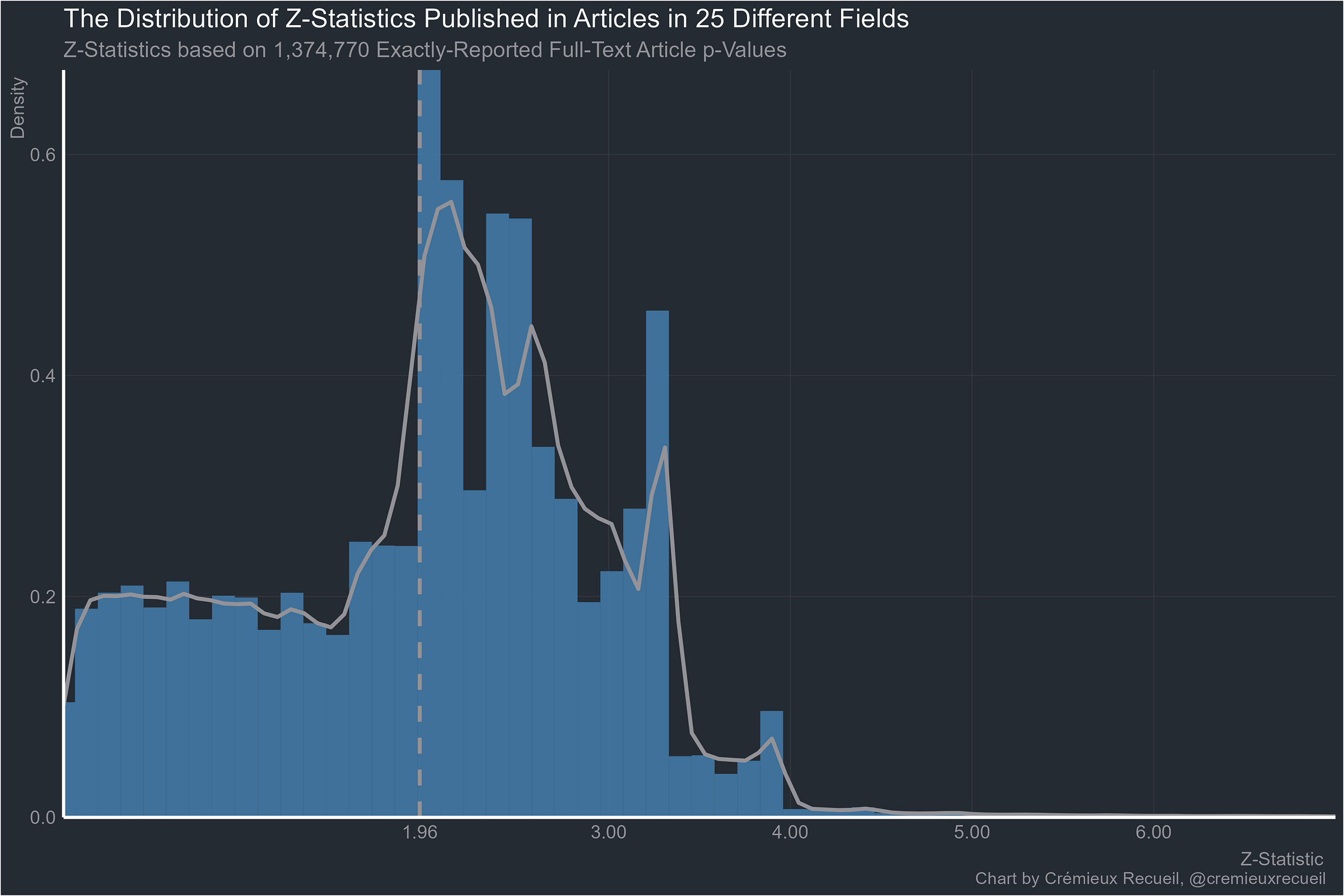
And here’s all the data we have exactly-reported p-values for. It’s for science in general, so it felt appropriate to include “Other/NA”.
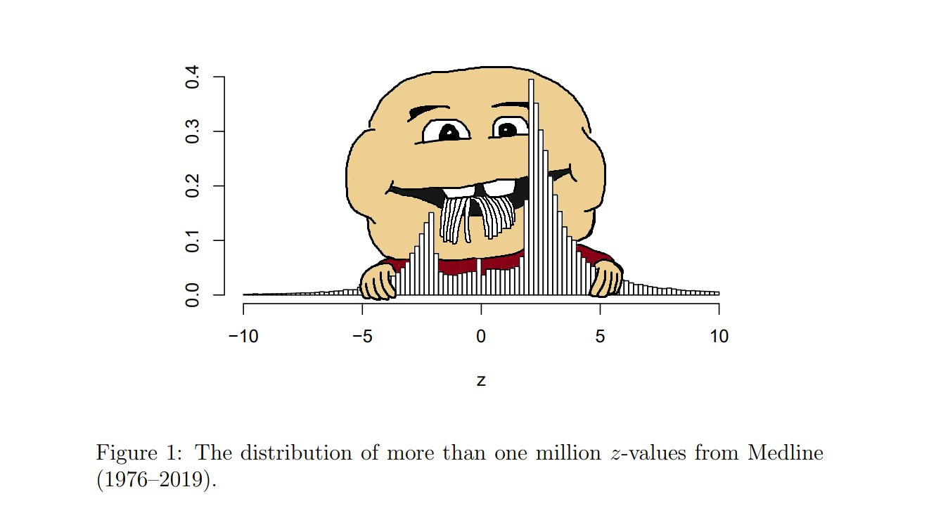
This set of results is very similar to the aggregated one reported by van Zwet & Cator (2020).3 They looked at more than a million z-values reported in Medline between 1976 and 2019 and they found that there was an extraordinary paucity of values between -2 and 2, very close to the conventional significance bounds of |1.96|. Their result looked like these ones:
Going through these examples clearly shows why the replication crisis is a universal. Every field is beset by p-hacking and a fraudulent bunching of p-values around points that scientists think feel significant. Results that are obtained by cheating or that are selectively reported will obviously have a hard time replicating. But at least the economists are doing better stats than anyone else (p < 0.0000000000000001).
There are several years of data, but in aggregate, bunching on the uncanny mountain did not improve in more recent years and, to my knowledge, no field has shown itself as a paragon of improvement since these studies and their data were published.
For this part, p-values were presumed to originate from two-tailed tests, but it did not make a difference with respect to thresholds if it was assumed that all p-values were to be transformed as-reported.
For these graphics, 100 histogram bins were the default, with different values used and noted when graphics looked awful with 100 bins.
In an earlier version of this article, charts based on all full-text p-values from each field were shown, but I have changed out those charts for ones based only on all available p-values for economics and only exactly-reported p-values for the rest to avoid any bias from people reporting p-values as inequalities like “p < 0.05” or “p < 0.001”. Economics data was never reported as inequalities, so it lacks this issue.
Alternative explanation I: Nonsignificant results may not be reported at all and thus they won’t appear in the dataset.
This cannot explain the results. Remember that when results should be significant because you have adequate power to detect a real effect, only a small percentage of p-values will be in the 0.05 to 0.01 range. People should be reporting p-values that are much lower for typical significant effects, but they aren’t: they’re reporting suspicious effects. Publication bias is usually a bias towards significance not a bias towards a p-value between 0.05 and 0.01. People adjust their marginal estimates of interest to get at least below 0.05 but they don’t take their extremely significant estimates and adjust them so they’re in the suspicious range.
Alternative explanation II: Some fields use different significance levels. If you look at the full 0.10 to 0.01 range, economics would end up one of the worst fields.
This is easily tested and the result is plainly in disagreement with the premise. Economics still clearly leads the pack in credibility while the rest of the fields barely had any rank order changes. This is saying something because economics did have the largest increase in suspiciousness, as one might expect from their common use of the 0.10 threshold.
My preferred explanation for why economics seems to outperform by this metric goes like this. First, economists love tabulation. They report lots of tables full of results, many of which are not significant and they report tons of theoretically relevant tests that may be important for understanding alternative explanations and hypotheses, many of which are also not significant. Second, the credibility revolution worked so this tabulation habit was augmented. The field really did become more credible by virtue of things like testing the sensitivity and robustness of results, using modern and appropriate methods, thinking about designs, etc. Just read modern empirical economics papers and you’ll find proofs, you’ll find models written out very cleanly and clearly, and in general, you’ll find a level of rigor that tells you economists are a lot smarter than other social scientists. Why they beat so many other fields is also probably partially down to how those fields are dominated by people who are mostly not concerned with statistics, so their statistical results are rightly much dodgier since, unlike economists, they’re content to plug and play until p < 0.05 while economists are more willing to say results are marginal.
Economists are smart, their field is prestigious, and their field has established norms that have facilitated vastly better reporting and accordingly more credible results, even if they still frequently make the mistake of focusing on their dodgiest ones in their papers. That last part is important. Even though economists report a lot more tests, it is still not uncommon to find papers where they focus on the results that bunch up under their preferred significance threshold or on results that are so marginal that they shouldn’t be discussed. Because they are less likely to report p-values and their p-values instead have to be derived from reported estimates and standard errors or confidence intervals, this is often much harder to see. But these examples frequently come with enough additional tests so we can see that their interpretation shouldn’t be trusted, whereas in other fields without as much reporting, you just have to take the dodgy statistics for granted since alternatives and robustness and sensitivity tests were less likely to even be reported.
Economists are not immune to problems, just look at their median power. But, they’re at least not as brazen as other fields.
Z-statistics were computed based on reported p-values or statistics like confidence intervals that could be used to compute a test’s p-values. If there were inaccuracies, intentional or otherwise, in any of those statistics, then the resulting Z-statistics could be miscalculated compared to their true values. Hartgerink et al. (2016) showed that this is a real concern because many people report that results are p = 0.05 when in actuality these statistics are sometimes below 0.05 and usually above it. This is evidence for the questionable research practice “incorrect p-value rounding” and it’s another way that cheating results can get published.
Many values were probably misreported further out than the 0.05 threshold, which could explain clumping at levels like z = 3. That level is a p-value of roughly 0.001, which is another widely-sought significance level, so an excess of points just beyond its z may also be explained by the same biases that lead to an excess under 0.05.
Since many p-values were taken as-is, there will be clumping if fields choose to report their p-values in ways that are disadvantageous to the prospect of finding a continuous distribution of p-values. For example, if people report p = 0.001 when p is well below 0.001, artificial clumping will follow. This probably did not affect the exactly-reported results for clumping between 0.05 and 0.01 since those are relatively high p-values/low z-values but this sort of artefact and rounding by data curators almost certainly affected the graphs beyond that level.
Chavalarias et al. noted that in the biomedical literature, the proportion of papers reporting p-values with inequalities instead of exactly declined between 1990 and 2015. To account for potential clumping due to the use of inequalities, I remade the ranks by whether inequalities or exact p-values were reported. This data was not available for economics.
Exact p-values were less suspicious than ones reported with inequalities but all fields were still extremely suspicious and even with exact reporting, none of them managed to beat economics. The rank correlation between inequality-based proportions and the baseline ones was 0.989 and for exactly reported proportions, it was 0.545. Both correlations were highly significant and if economics was added in, they changed to 0.990 and 0.595, respectively.


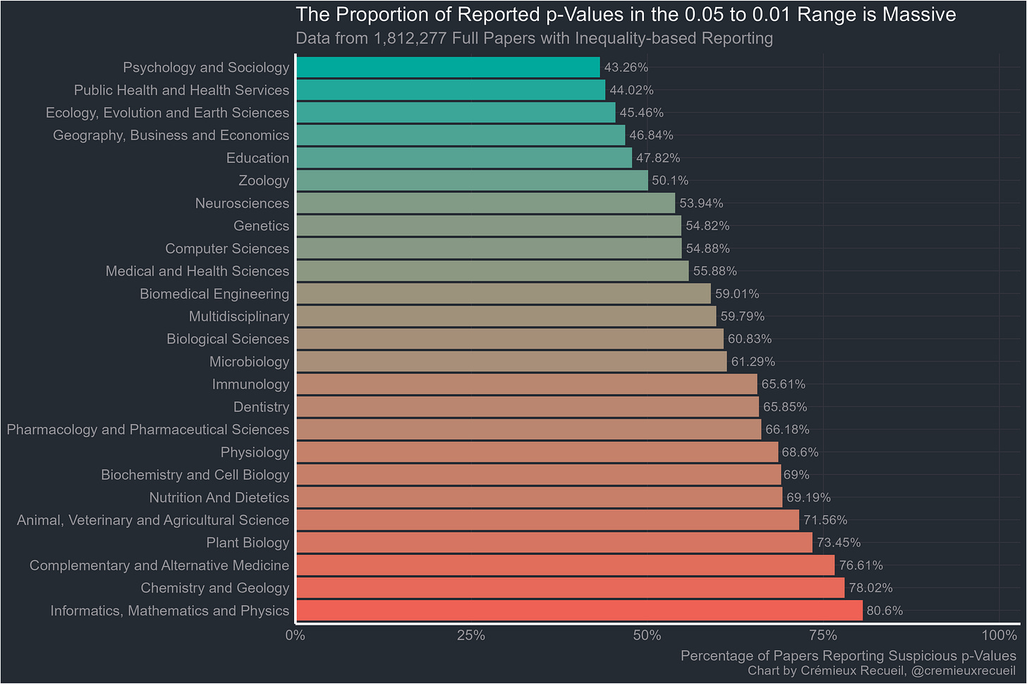
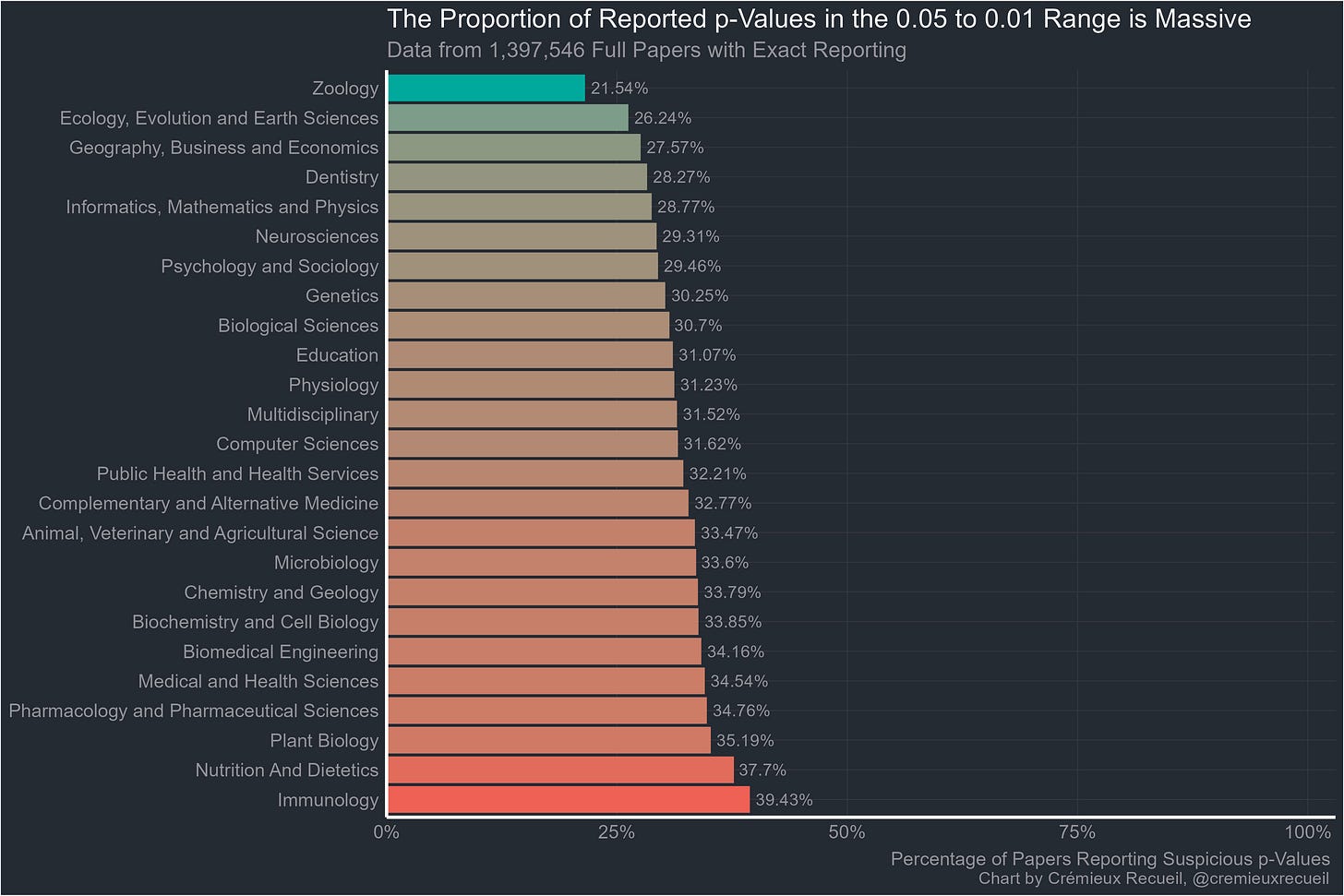
I am very surprised at genetics looking so bad. Geneticists are mostly very aware of the problems of multiple hypothesis testing and do a lot about it. I really want to see how the Z statistics were collected.
What math papers are reporting p-values? Stats?