Today’s post is brought to you by my sponsor, Mechanize. They’re hiring junior software engineers at $300K/year base salary.
I recently read a new article that claimed that America’s housing affordability crisis was being driven not by a lack of supply, but by runaway inequality. I like this article. I don’t like it because it makes a convincing case—it doesn’t—, but rather because it sets us up for a teachable moment: it’s so bad that we can learn a lot about how not to do science or economic reasoning if we understand it.
The Literature Review
The article is mostly qualitative, involving the authors sketching a variety of weak, misleading, or completely incorrect arguments, without making a single important or useful point that isn’t simply a restatement of something widely known and understood. It starts off with a literature review that’s both selective and misrepresents the papers it cites. Their review is used to support this argument:
Housing regulations are local while housing markets are regional;
Upzoning in one locality can redistribute construction within a region rather than increasing total regional construction;
Many reforms raise land values while having mixed or tiny short-run effects on construction;
Therefore, deregulation is not a reliable way to make regions affordable.1
To put it bluntly, this is an annoying, lazy, and unhelpful style of argumentation. Noting a bunch of caveats for other people to deal with, without actually quantifying or qualifying their importance is unserious scholarship. It’s a caution fetish. If you’re going to attempt critique, try to be helpful and thorough when you do; you’ll be doing a service to yourself and to readers, and if you aren’t thorough, you might mislead people into thinking that the things you brought up are more important than they are.
We can easily add some quantitative color to the authors’ arguments, but before doing that, I’d recommend understanding something: there’s been a national permitting downturn. By that I mean, the number of permits to build new homes dramatically declined in a short period of time, right before the Great Financial Crisis (GFC), and the recovery has not yet been complete.2
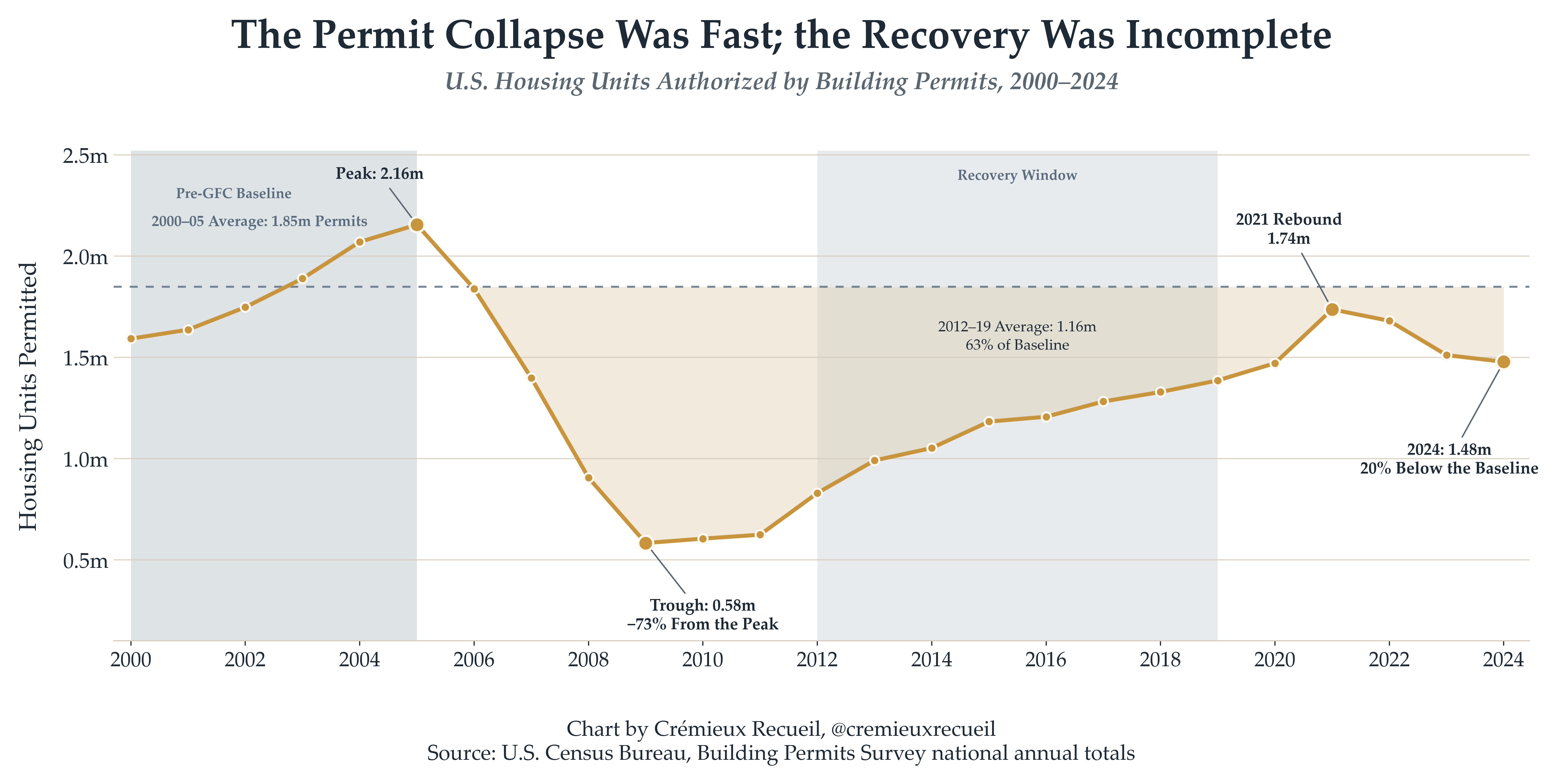
Some metros saw slower and others saw faster recoveries. The extent of recovery can be leveraged to estimate the effect on housing prices. This isn’t causally informative without also incorporating the effects of policy reforms across different metros, but we have plenty of examples of that, so if you check my replication package, you’ll notice several plausibly causally informative specifications and results matching the general thrust of what I’m going to outline here and what other authors tend to find in the broader literature. That is, that more permitting means lower housing prices.
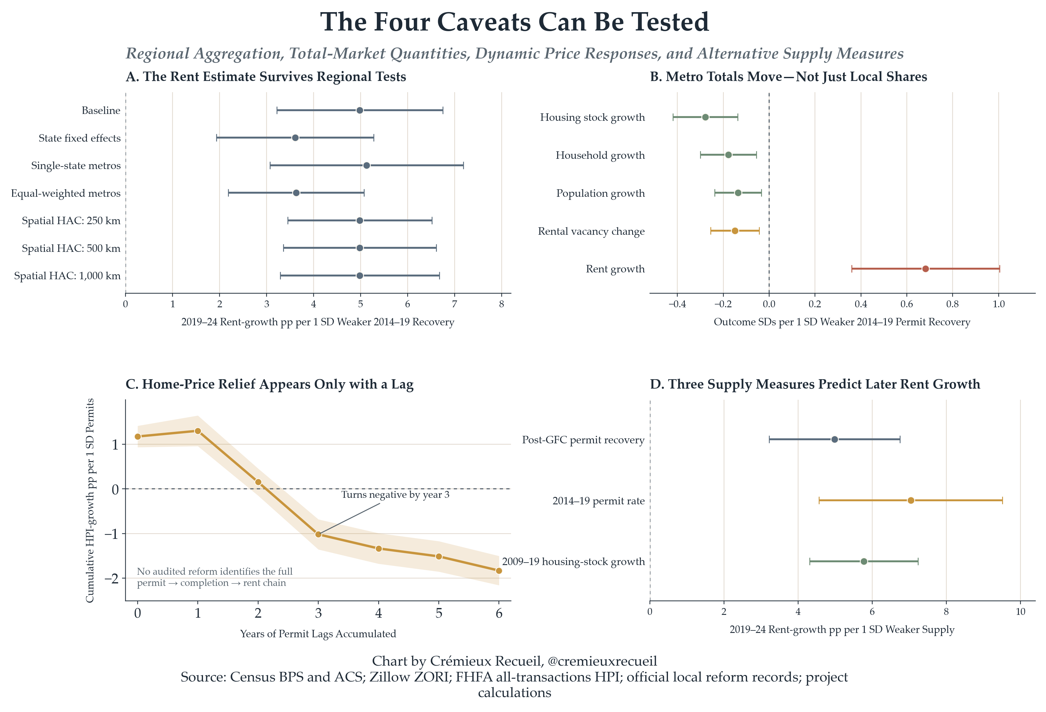
I first tested whether aggregate permits and housing stock growth were correlated across metropolitan statistical areas (MSAs). Pure redistribution among municipalities doesn’t have the ability to explain changes in total (population-adjusted) construction. Pure redistribution wasn’t even close to being supported. Instead, there was evidence that a weaker post-GFC permitting recovery predicted less housing stock growth, less household growth, less net domestic migration, and more rent growth. Other measures agreed, and using a holdout of pre-COVID era data showed that weaker permitting recovery before COVID was associated with more rent growth during COVID.
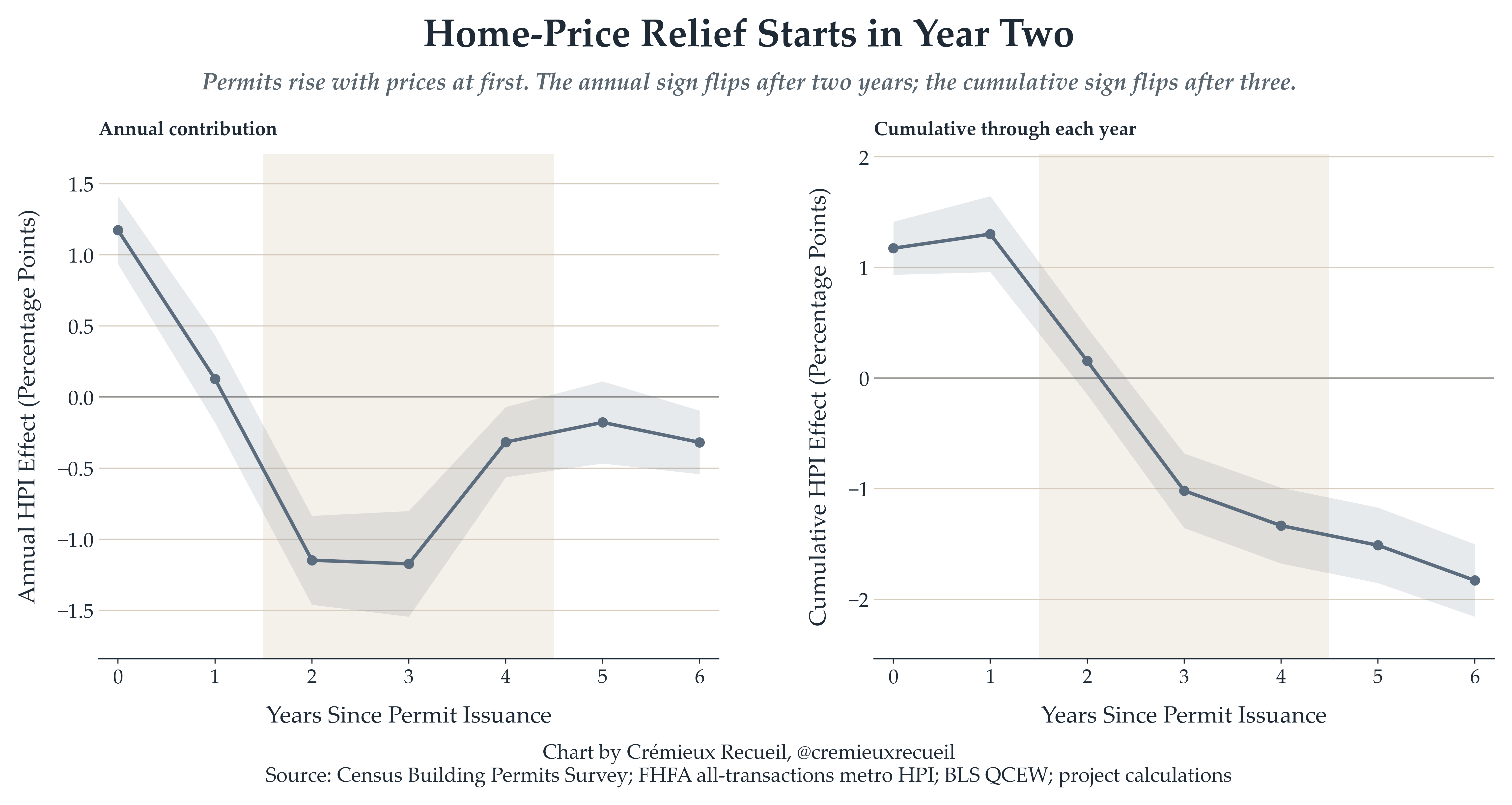
The result that areas that did more permitting see lower rents down the line survived state fixed-effects, multiple definitions including three based on permitting and one based on actual housing stock growth, and I was able to investigate the lag structure and building type specificity of permitting effects, too. I found that the benefits to housing prices appear to show up years down the line—which makes sense, given prices take time to adjust—and they’re particularly (2x) pronounced for multifamily unit construction.
The authors’ conclusions don’t seem very well-supported by publicly available data. The authors could’ve known this and reformulated their conclusions or at least qualified them better by saying that they only plausibly amount to quibbles. They didn’t. Instead, they went on to argue
Overall vacancy is now higher than it was in 1970;
Between 2000 and 2020, household formation didn’t exceed housing supply growth in major urban areas;
Average household sizes fell from 3.2 to 2.6 people in that period;
Accordingly, if housing were genuinely scarce, vacancies would be falling and people should be forced to live in larger households.
These facts do not align like the authors suggest though. There are actually several critical and well-known problems with how they did their reasoning.
Firstly, a “vacant” unit is everything from people’s seasonal and second homes to units that are between tenants to units that are located where there’s little demand, and very critically, units that are condemned or otherwise uninhabitable. National vacancy statistics are incapable of identifying whether rental housing is scarce in a particularly in-demand metropolitan area unless one gets extremely lucky. Secondly, household size is endogenous to age, fertility, marriage, income, migration, housing quality, and other aspects of demographic composition. Declining household size can itself increase the demand for housing—and it does! Finally, comparing total household growth with total household stock growth completely neglects prices! It doesn’t mean a lot for affordability if supply ‘keeps up’ by prices rising enough to stall household formation, exclude certain households, inducing out-migration, and preventing in-migration.
The authors could have tested this idea too. The idea is to use permitting numbers to predict stock growth and subsequent effects on household and resident numbers as well as vacancies and rent growth. Weak permitting recovery does indeed seem to come with lower housing stock growth, subsequently fewer households and residents being locally accommodated, tighter vacancies, and higher rent growth.
The authors then reviewed some literature on supply-to-price elasticities, emphasizing that builders like to build where demand and prices are rising so the correlation between construction and prices is affected by endogeneity. They note some modest, <1 elasticities and suggest that stock shortfalls are therefore unimportant. This point does not follow in any case, as we’re not really interested in the rent change this year divided by the permits this year, we’re interested in something more like the cumulative rent differences several years prior over the cumulative completed difference in housing stock over time. The lag tests act as relevant evidence here, and the authors should have done them themselves.
As the last bit of their review, the authors looked at a small subset of the evidence on filtering, the process by which housing becomes more affordable as it gets older. To get at this, they looked at Rosenthal’s “repeat income” model, which, in their review, implied that there’s roughly 2.5% annual downward filtering for rental units, as measured by occupant income, and 0.5% annual downward filtering for owner-occupied housing, with just about 0.31% annual price depreciation for multifamily rental housing. They note, correctly, that filtering is heterogeneous across markets and it can reverse in some cases.3 Nothing to test here given their narrow focus.


The Calculator Fallacy
With their background out of the way, the meaty thing the authors did was a simulation. For their simulation, they chose six particularly expensive commuting zones—San Jose, San Francisco, New York, Los Angeles, Washington, and Boston—and they paired them with Census data on median recent-mover one-bedroom rents, median annual wages for full-time workers without college degrees, and an “affordable” monthly rent equal to 30% of those workers’ wages. They then specified an annual housing stock growth rate of 1.5% and calculated R = C \times E + F, where C is annual construction, E is the price elasticity to supply, and F is filtering or depreciation. They then compound that until the initial rent reaches their affordability threshold: T = \frac{log(W/H)}{log(1-R/100)}.
The two simulation scenarios were “Optimistic” and “Pessimistic”, and they were defined by construction rates of 1.5% in both, respective elasticities of 1.0 and 0.2, filtering of 2.5% versus depreciation of 0.3%, and respective assumed annual declines of 4% and 0.6%. With these scenarios in hand, the amount of time required to reach affordability ranged between 9 and 22 years optimistically and 60 to 150 if we’re going by the authors’ definition of pessimism.
But this is basically a pointless exercise. There’s no causality indicated by this simulation. Their simulation is, in fact, just a calculator: you input parameters and get mechanically determined figures out, and they may or may not correspond with reality. The result they get is the result they put in, and due to the simulation’s lacking parameters, it’s doomed to be unrealistic and to have inputs that are highly sensitive to the specification. For example, with defensible specifications based on numbers and ranges we can find in the paper and its sources, San Francisco could take between 18.3 and 124.1 years to become affordable.
What if we added migration? Well, it could take much more or much less time for every city to reach affordability then. You can actually do this with any number of plausibly contributing parameters, but regardless of what you add or subtract from the equation, you never get any closer to being able to make a conclusion for a simple reason: being able to calculate a number doesn’t mean the number matters.
Just building homes may take a long time to make median market rents affordable for low-wage workers, sure. This is a conclusion that’s supported by the authors’ exercise because in some universe, the simulation could be sufficient to describe reality. But the exercise cannot be used to make claims like ‘Supply has limited effects on rents.’ That can’t follow because the equation can suggest supply materially lowers rents while also leaving them unaffordable for particular households, no contradiction.
So What?
Using Census data from 1970 to 2021, the authors showed that among employed workers aged 16-64, there’s been much faster real wage growth for college and graduate workers than for those with lower levels of education. This is a well-known phenomenon, but the explanation actually seems quite lost on the authors. Most of it simply reflects that higher levels of education have become normalized and having some education is normal now, too. Sorting into higher educational categories and out of the lower ones has become a major force shaping the composition of different educational categories: a college degree is now normal, not impressive; only graduating high school is now below-average, not above-average; etc.
Presenting these education facts doesn’t really tell us much of anything, but the authors want to use them to convey that inequality has increased, thus providing them a mechanism for their main claim, that increasing inequality has caused the housing crisis. They basically argue by insinuation, by vibes.
To do this properly, unlike what the authors did, you’d use wages instead of education, and you’d regress real rent changes on changes in wage dispersion over time, using multiple margins and different timings. I tested the effect of the 90/10 ratio, 90/50, 50/10, 75/25, 90/25, 75/10, the Gini coefficient, top-5% and top-1% shares, etc. Coefficients ranged from piddling to paltry and were unstable and virtually always null with one-year lags.
Instead of running those sorts of informative tests, the authors then went on to show a scatterplot of commuting zone college-educated shares versus their subsequent college share growth rates and a chart showing a comparison of commuting zones by their 1970 college shares for the top decile for most initially educated cities versus those around the median. The comparison involved indexing two differences: absolute wage differences between city groups and differences in their college/noncollege-educated wage ratios.
This is supposed to show evidence of growing spatial inequality and “the shift from an American economy rooted in building physical objects to one producing knowledge", but it doesn’t show divergence across all metropolitan areas, a relationship between income and rent divergence, inequality being an operative variable, housing supply playing no role, or a conclusion that’s robust to different cutoffs for the margin for inequality. The authors just kind of showed some descriptive statistics and left it at that, when they could’ve done some testing.
The way I did the testing was in stages. In the first stage, I answered the question: do initially richer metropolitan areas subsequently pull further ahead? Between 2000 and 2009, initial pay levels predict convergence, 2009-19, there’s nothing, 2019-24, there’s a slightly negative relationship, and over the whole period 2000-19, the estimate is negative and marginally significant (p = 0.02). This is not what the authors expected.
In the second stage, I answered the question: does local pay growth predict rent growth? Between 2000 and 2009, rent growth correlated slightly with pay growth, the same held for 2009-19, and for 2019-24, the relationship fizzled out. So then, I answered the final big question the authors left unaddressed: do pay and rent dispersion move together geographically? The answer here is definitively ‘no’. From 2000 to 2019, employment-weighted pay dispersion rises roughly 5%, whereas rent dispersion rises some 38%, and the metropolitan-area 90/10 pay gap was flat—with a decline by 2024—whereas the rent gap on the same margin continued widening.
The authors were kind of gesticulating at a spatial sorting mechanism that evidently doesn’t matter in the ways they wanted it to. They then went on to do even worse. Look at their Figure 3:
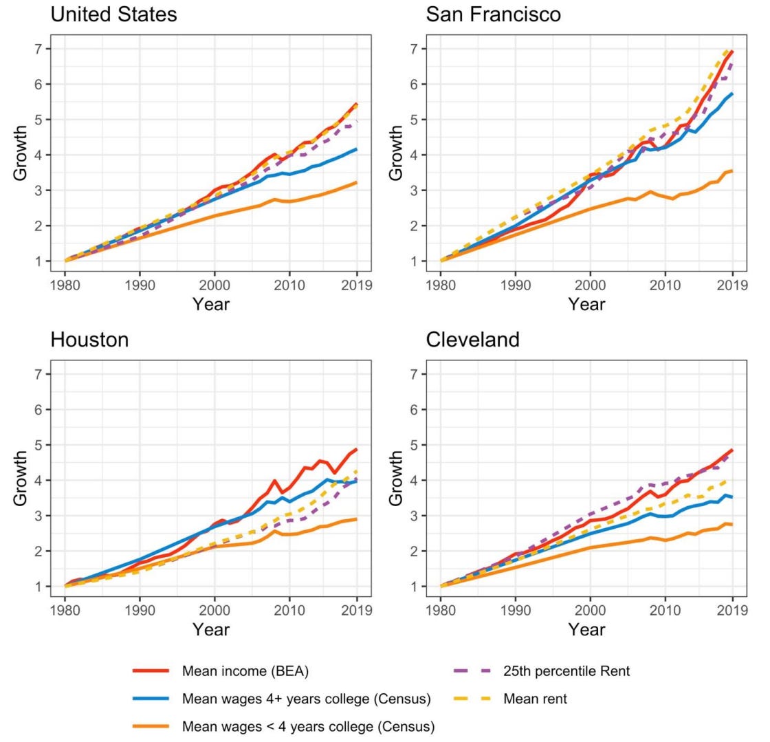
Based on this figure, the authors tried to argue that, rents rising with mean income while noncollege-educated wages lag shows a wedge that indicates the fundamental inequality mechanism at work driving up rents to unaffordability. But if you’re familiar with this website, you probably know that you shouldn’t make this sort of conclusion based on comparisons of trending levels of things. Trending variables are frequently highly correlated even when their short-run movements are uncorrelated and there’s no causal relationship. This is how we get ‘organic food causes autism’ or ‘the president’s age is causing the U.S. to increase in age, r = 1’.
More problematically, this is a select sample, not an illustrative set, and it deviates from the other figures the authors presented in that there’s no label indicating how inflation was dealt with. So, I ran three tests:
I checked the employment-weighted national data for 2000-24 and found a real income/rent level correlation of r = 0.872 (which is substantially outlier-driven), but an annual change correlation of just r = 0.220;
I added metro and year fixed-effects. The real level elasticity was 0.628 and the model R² was a staggering 0.922, but this extreme variance explained was due to the large number of metro and year fixed-effects in the model. Income’s partial R² was just 0.0065;
I used annual differences.
With year effects, the contemporaneous real pay elasticity was 0.045 (p = 0.392);
With pay growth lagged by a year, the elasticity was 0.152 (p = 0.001).
Basically, real levels track but the trend moves slowly, income really explains little, and income is a lagged demand input, while the “almost perfect” tracking between mean income and rents that the authors illustrated overstated how much income explained. They basically did a lot of handwaving to justify nonsense eyeballing-based conclusions, and none of it stands up to scrutiny.
What Are We Even Doing Here?
The inequality-based mechanism cited by the authors is:
Mean income rises, driven by affluent households;
Mean income determines housing demand and rents;
Median and lower-tail wages fail to keep up with this top-led rise;
Rents become unaffordable.
Thus, the authors should predict that mean income growth should outperform median income growth in predicting changes in rent. So—and I admit this is a very crude test—I fit simultaneous regressions including mean and median income and weak permitting recovery as a sort of horse race. Because mean and median income are highly correlated, partitioning the variance between the two can be hard, but the authors still predict that the mean should be better than the median. Alas, it is not: alongside the median—which predicted much more rent growth—the mean generally predicted slightly negative rent growth. Weak permitting recovery (meaning under-permitting relative to the pre-GFC regime) consistently predicted higher rent growth.
This could reflect endogenous migration and selection whereby higher rents expel poorer households and raise the observed median, but that doesn’t rescue the authors’ inequality claims! If we want to really test those, we’ll compare the effects of a weak permitting recovery and wage dispersion growth—at any margin or Gini—directly, and we’ll find…
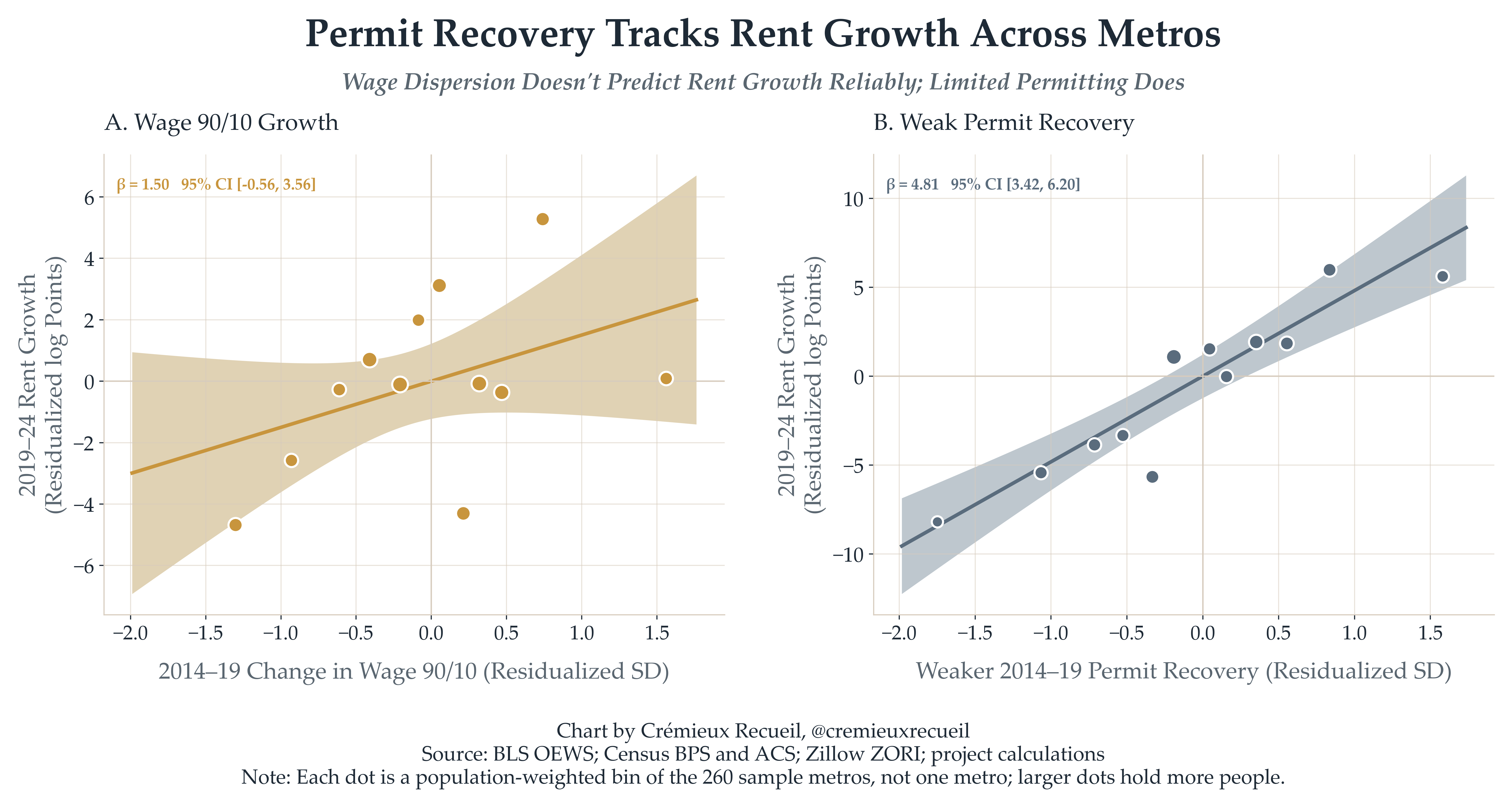
As I noted at the beginning of this article, I ran a lot more tests and used a lot more measures and looked into a lot more scenarios than I’ve elaborated on here, and more importantly, than the authors of the paper I’m focused on likely even considered. There is, to be frank, basically no case for what they argued, and it’s very odd they argued what they did given that it was fully possible to go and test many of their claims and predictions, and every test came up wanting.4
I like the paper this post is about, not because it’s good, but rather, because it’s so bad. If you can understand why it’s bad, you can understand why so many simulation studies are worthless; why selective and partial literature reviews can mislead you; the importance of thinking through the implications of your claims and ensuring that they hold up before you put them out there for the world to judge; etc. This is a terrible piece of scholarship, but it would make for a great article for undergraduate economics or statistics students to spend an hour or two disassembling.
The study is basically a work of advocacy and an expression of ideology, not a contribution to the field of economics or to our collective knowledge. What it says that is true is widely known and reported by authors who’ve surrounded those facts with less baggage; what it says that’s novel is false or exaggerated to the point of being misinformation.
To the extent the paper might be intended to inform on policy—and on that note, all it seems to want to do is denigrate supply-side reforms—it should be laughed at. The paper is all about ‘can’: inequality can push up rents. But does it ‘tend’ to? No, and policy papers need to be about how policies ‘tend’ to work. Removing restrictions on building housing does tend to reduce rents and home prices. Would said reforms do so as a rule in each and every place they’re implemented? Certainly not. But that’s not what’s relevant for policymakers. They need to know what to expect, not to hear a bunch of quibbles that make it sound like the general tendency of a policy is to do nothing or to have the reverse of its realized effects.
We should qualify our policy expectations rather than thinking solely about general tendency, but we should not do so like this paper did, in a manner that makes doing anything seem futile. If these sorts of leftists eking out an existence in the academy had their way, we would simply do nothing because of the possibility that doing something leads to everything going wrong when we know things should go great.
You can see the replication and extension code for this post by clicking here!
This was a timed post. The way these work is that if it takes me more than an hour to complete the post, an applet that I made deletes everything I’ve written so far and I abandon the post. You can find my previous timed post here.
A message from my sponsor, Mechanize:
We’re hiring software engineers to build environments and evals that frontier AI labs use to train coding agents.
To get a better sense of the work we do, you can check out GBA Eval, where we had models build Game Boy Advance emulators from scratch and scored their performance.
Base pay starts at $300K/year for junior software engineers, with more for senior roles, plus equity and performance bonuses. Apply here.
The admirable part of this sort of wishy-washy handwaving style of scholarship is that it can help to remind us of certain facts that might go unsaid in typical discussions of housing policy because they’re obvious. The benefit of this is that sometimes facts that are so obvious they get overlooked can result in a ‘Eureka!’ moment that leads to better ways of identifying and qualifying the effects of different reforms because someone is saying it. Think of it like this: it’s like if an outsider to your field comes in and starts preaching about [Field] 101 and you forgot some of the truths from 101, but now that they’ve jogged your memory, it’s inspired an idea.
The timing of the recovery window doesn’t really matter. I tested the effect of making the window start in every year from 2010 to 2014 and the estimated effects of slower permitting rate recovery were statistically and practically indistinguishable across windows. See also:
This section is quite weird, because the authors misunderstood filtering in a way that makes it appear more important than the literature on actual rent depreciation does. In their simulation, they added a 2.5% occupant income filtering rate directly to the assumed rent price decline, so their optimistic result is more favorable than it deserves to be.
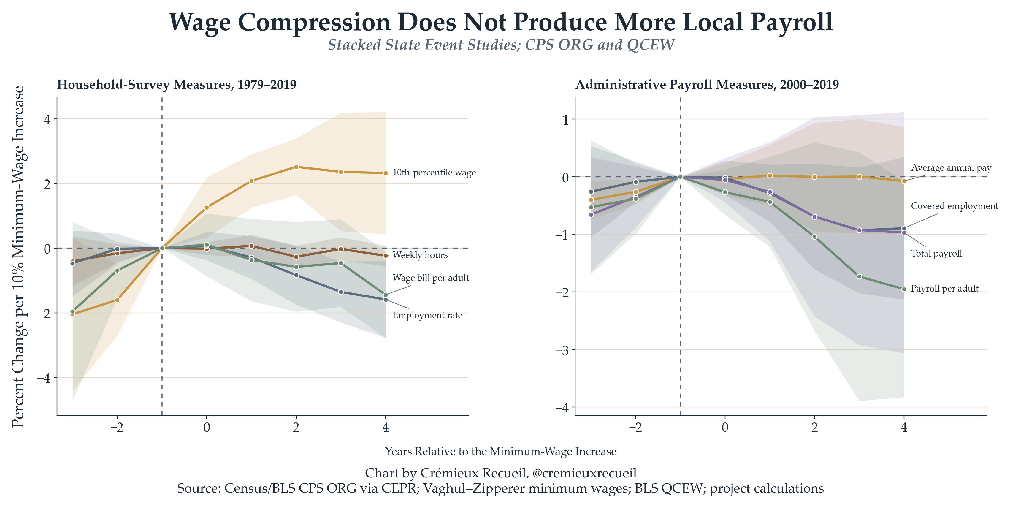
One of my favorite tests was when I looked at the recent reversal in wage dispersion that started under the Biden administration. Though the authors would predict that it would make housing more generally affordable, it didn’t lead to any deviation from trend. I also thought messing around with minimum wage data resulted in some cool findings: